19+ Artistic Kitchen Layout With Colorful Murals And Open Space Ideas
The kitchen can feel like a blank canvas when the layout gives art room to breathe. With murals, open space, and smart zones, everyday cooking can look like a creative studio.
Picture a wide open kitchen where one wall is the star, painted with bold colors and soft shapes. The rest of the space stays bright and uncluttered, so the mural feels like it’s moving.
This layout makes the kitchen feel airy while still giving you a clear focal point for daily life. Keep the main work line on the side opposite the mural, so your attention stays balanced while you chop and stir. Choose light cabinets and warm flooring to make the mural pop, and consider a low-gloss finish on painted areas to reduce glare.
2. Gallery-Style Layout With an Island as the Artwork Frame
Gallery-Style Layout With an Island as the Artwork Frame
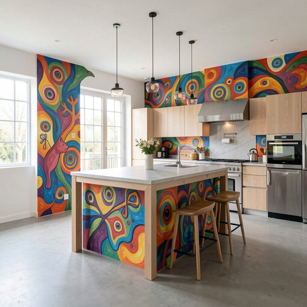
Think of your island as a stage, centered so the colorful mural behind it looks like a gallery backdrop. Wide walkways on both sides help people move comfortably, even during busy meal prep.
Choose a simple, sturdy island shape with an edge that contrasts the mural colors, like pale stone or light wood. Add open shelving near the mural so jars, cookbooks, and artisan plates echo the artwork, while keeping the island surface mostly clear. For practical flow, place the sink close to the mural wall and the cooking zone on the far end of the counter run.
If you want a unique touch without major renovation, use removable wall mural panels or fabric wall art framed like prints. Pair the mural with matching textiles such as dish towels and chair pads to keep the look intentional. Cost stays easier to manage when you invest in one big statement wall and keep everything else in calmer tones.
3. U-Shaped Cooking Zone With a Colorful Ceiling Spot
U-Shaped Cooking Zone With a Colorful Ceiling Spot
A U-shaped kitchen naturally forms a work loop, and it can pair beautifully with an unexpected mural element above. Imagine cabinet lines hugging three sides while a painted pattern or mural-style design runs partway across the ceiling.
This layout is great for busy households because everything stays within reach, from the fridge to the sink and stove. When you design the ceiling color, use it like a soft spotlight that guides your eyes toward the center of the room. For personalization, match ceiling colors to the mural theme, such as leafy greens, seaside blues, or warm sunset oranges.
To keep open space feeling real, leave gaps between the upper cabinets and the ceiling when possible, or use a slightly taller backsplash that stops short of the top. Add a pendant light with a simple shape so it doesn’t fight the painted area. If you’re budgeting, consider painting only one ceiling band or using a ceiling tile mural system rather than covering everything.
4. L-Shaped Counters With a Dedicated Open Dining Nook
L-Shaped Counters With a Dedicated Open Dining Nook
An L-shaped counter set-up gives you a clean cooking corner and leaves the rest of the kitchen open for art and conversation. Place a mural on the short wall of the L so the dining nook feels like it has a colorful backdrop.
Benefits show up fast when people can sit, eat, and talk without stepping into the prep zone. Keep chairs at least a comfortable arm’s length away from the island edge, so movement stays easy. Add a small rug with colors pulled from the mural to tie everything together and soften hard floors.
5. Straight-Line Kitchen With Artful Storage and a Wide Passage
Straight-Line Kitchen With Artful Storage and a Wide Passage
A straight-line kitchen can look sleek and calm, especially when you maintain a generous passageway from entry to dining area. Use a mural on the wall directly opposite the counters, turning that long view into something joyful.
This keeps your workflow simple and helps the space feel larger because you’re not boxed in by extra counter runs. Hang open frames or a ledge for ceramics in front of the mural, so the art feels layered rather than flat. If you want uniqueness, paint a small custom pattern on the inside of cabinet doors, using colors that echo the mural for a fun surprise when you open them.
To stay practical, install deep drawers for pots and a pull-out pantry so you don’t rely on cluttered surfaces. For cost considerations, focus spending on hardware and built-in storage rather than adding extra cabinetry lines. A mural print option can also keep the budget friendlier while still giving that wow factor.
6. Split-Zone Layout With a Mural Divider and Soft Boundaries
Split-Zone Layout With a Mural Divider and Soft Boundaries
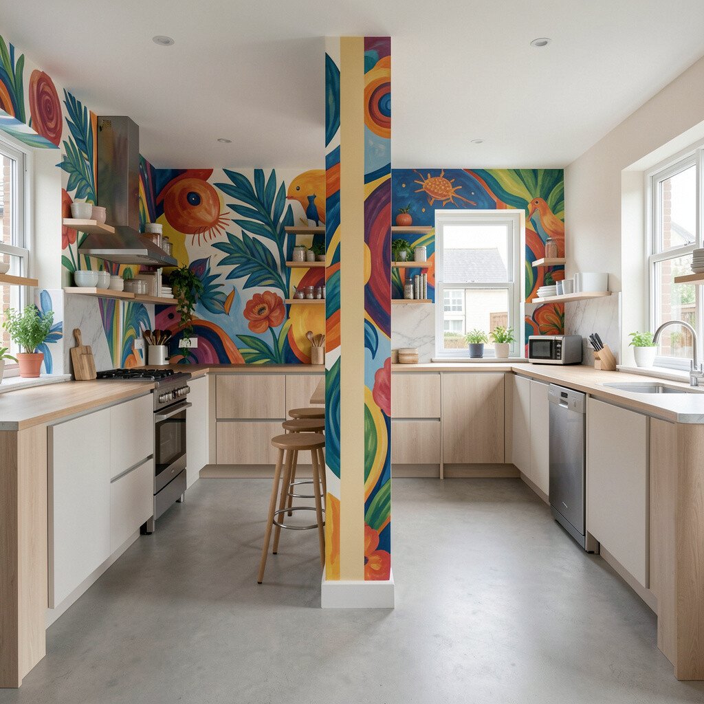
Sometimes open space feels best when it has gentle boundaries, and a mural divider can do that beautifully. Imagine a partially open wall or half-height panel with a colorful scene that separates cooking from sitting without shutting anything off.
This creates clear zones while still letting light travel through the kitchen. Use matching grout lines or a consistent material for the divider so it feels intentional, not accidental. For personalization, choose a mural style that fits your life, like playful food characters for family energy or calm abstract waves for a calmer mood.
7. Corner Cooking With a Window-Centered Muralscape
Corner Cooking With a Window-Centered Muralscape
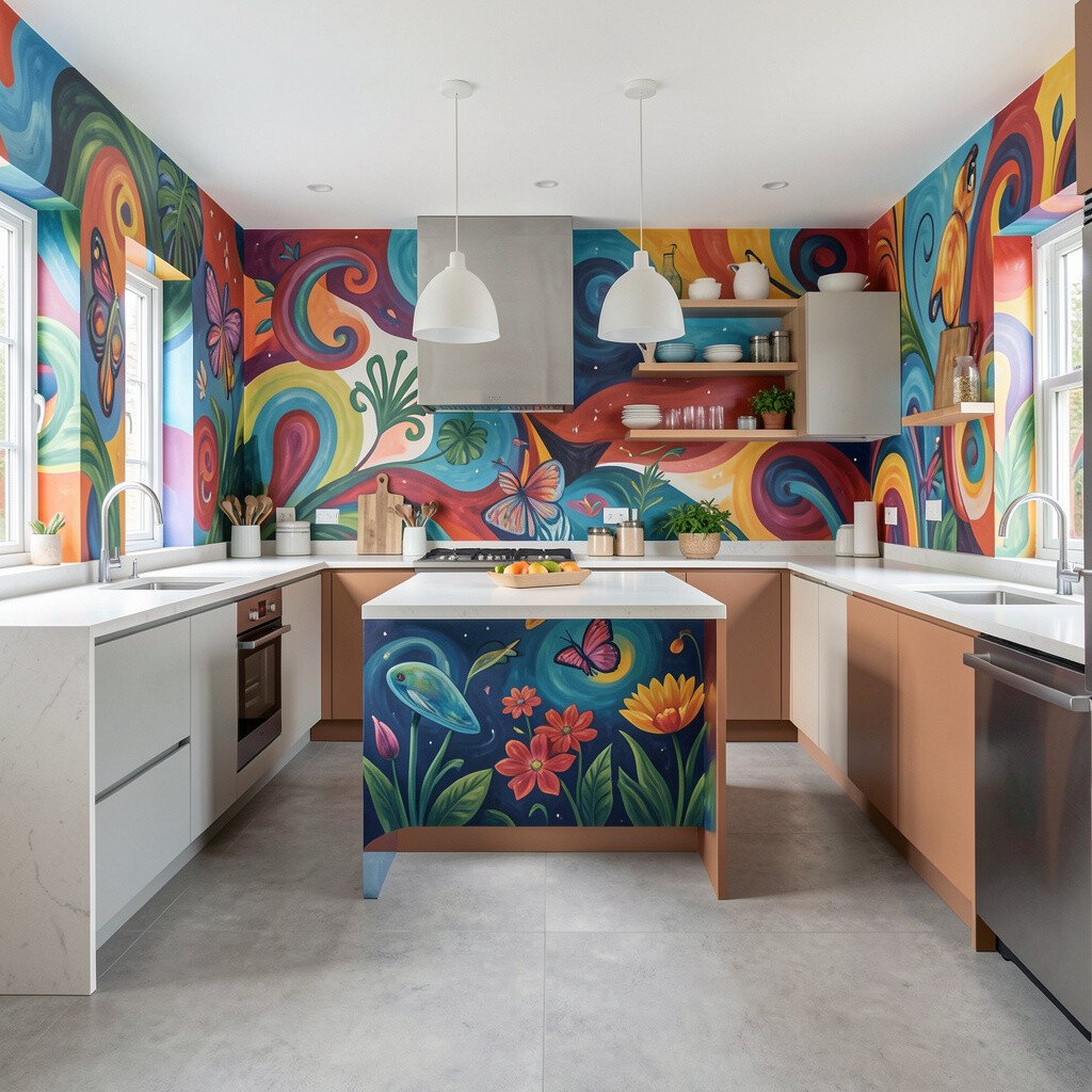
When your main counters wrap around a corner, the best trick is to center your mural around a window view. Put the mural on the wall that frames the window so the outside light and the inside color work together.
This benefits natural light, because the mural acts like a colored filter rather than a heavy block. Keep the window area clear with a minimal curtain and a narrow sill display, so the room stays light. If you want it unique, pick a mural palette that complements the view, like matching sky tones or garden hues.
For practical tips, place your prep area under brighter light from the window and keep knives and sharp tools in drawers rather than on open shelves. When budgeting, you can print a mural that fits the wall size precisely, then adjust the rest of the palette with paint samples and smaller decor purchases. A cohesive color scheme reduces the need to buy many different items to make it feel finished.
8. Open Shelf “Frame” Layout With a Bold Mural Backdrop
Open Shelf “Frame” Layout With a Bold Mural Backdrop
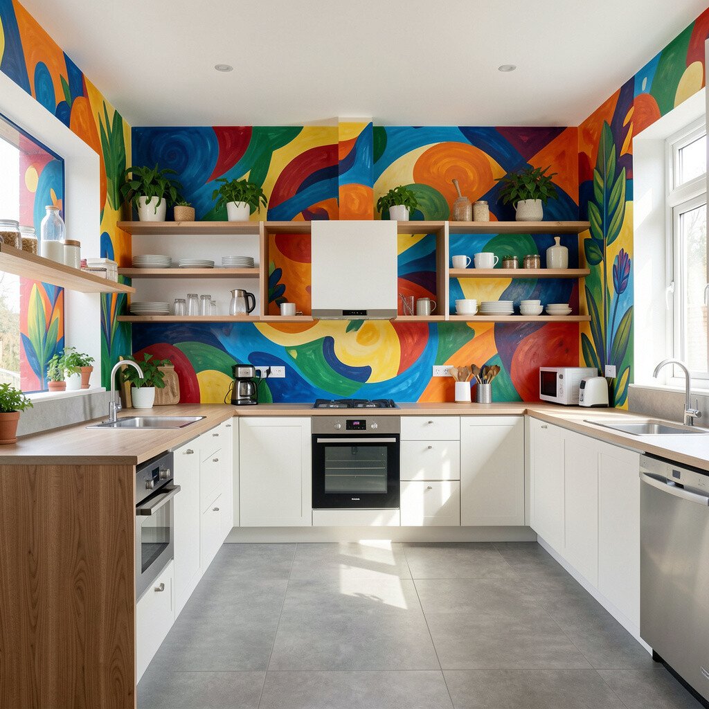
Open shelving can work like picture frames, especially when the mural behind it adds color and depth. Arrange shelves along one wall and let the mural fill the background, so every dish and jar looks curated.
This layout is ideal for people who like visible cooking tools and everyday beauty in reach. Keep items grouped by color and height, and avoid overstuffing so the shelves don’t compete with the mural. A practical approach is to reserve the top shelf for decorative objects and keep heavier daily items lower where they’re easier to grab.
9. Island-First Layout With Seating Facing the Mural
Island-First Layout With Seating Facing the Mural
If your island is the social heart, seat people facing the mural so the art becomes part of the conversation. A wide island with bar-height stools can keep the cooking line slightly separate while still feeling open.
This helps guests stay comfortable without blocking your movement when you’re cooking. Install outlets on the island side facing seating for phones, smart appliances, or a small blender station to make the space truly useful. For personalization, add a backsplash ledge or a tray station that holds a color-matching set of utensils and spices.
To keep costs in check, consider using peel-and-stick backsplash panels for the cooking area, since that’s where splashes happen. Pair that with a hand-painted or professionally printed mural, which can be a one-time investment that boosts the whole room. Trends right now lean toward warm neutrals with bright art accents, so try cream cabinetry with saturated mural colors.
10. Lively Pop-Color Cabinet Layout With Mural on a Quiet Wall
Lively Pop-Color Cabinet Layout With Mural on a Quiet Wall
Not every kitchen needs a mural on the busiest wall, and that can be a smart way to keep the room balanced. Use a mural on a quieter wall while adding a pop of color to cabinetry or drawer fronts along the main counters.
This layout feels both artistic and practical, since the cooking surfaces stay easy to clean and organized. Pick one cabinet color pulled from the mural palette, then keep everything else neutral for harmony. For personalization, add magnetic spice boards or a small pinboard where you can swap recipes and grocery lists.
11. Minimal Counterlines With a Mural-Wrapped Breakfast Corner
Minimal Counterlines With a Mural-Wrapped Breakfast Corner
When you prefer a calm, uncluttered look, reduce counterline clutter and let a breakfast corner become your mural stage. Imagine a small bistro area by a wall with colorful painting, while the rest of the counters stay sleek and mostly empty.
This benefits daily life because a clear countertop means you can start cooking without moving around piles. Keep the backsplash and countertop colors light, so the mural owns the room without making it feel crowded. Add storage underneath the breakfast bench, so cups, extra plates, and baking sheets stay hidden.
To make it unique, choose a mural theme that fits the breakfast routine, like fruit sketches, coffee swirls, or abstract morning sun colors. If you want cost savings, paint only the breakfast corner section and use murals as borders rather than full wall coverage. It can still look bold while avoiding the expense of covering every square inch.
12. Narrow Kitchen Made Open With a Vertical Mural Path
Narrow Kitchen Made Open With a Vertical Mural Path
In a narrower kitchen, open space comes from clever visual tricks, and vertical mural paths can help a lot. Paint or install a mural that runs from near counter height upward, giving the eye a “go up” direction.
This layout helps the room feel taller, which is a big win for small spaces. Keep your cabinets streamlined and choose hardware in a consistent metal finish so the room doesn’t look busy. For practical tips, install slim pull-out pantries and use corner shelves with rotating trays to avoid wasted space.
For personalization, repeat a motif from the mural in your accessories, like a tiny wave pattern on towels or a matching vase. Cost can stay reasonable when you use a mural panel sized for the vertical run and limit additional renovations. Current trends often pair bold artwork with simple lines, so your kitchen can feel modern without going overboard.
13. Curved Seating Layout With a Soft Mural Crescent
Curved Seating Layout With a Soft Mural Crescent
Curved seating can make an open kitchen feel more welcoming, and it pairs nicely with mural shapes that curve too. Picture a soft mural arc behind a seating area, echoing the round edges of a small dining table.
This benefits comfort because curved layouts reduce sharp corners in pathways and invite people to linger. Choose a mural palette that matches your chair upholstery, like coral with warm wood, or teal with cool gray fabric. Add a simple round pendant light so it feels connected to the mural’s shape.
For practical tips, keep the main prep zone on straight countertops so you still get efficient cutting space. Use trays and bins to corral everyday items, especially if the seating area is used as a snack station. If you’re budgeting, paint the mural arc directly onto the wall, then keep furniture purchases minimal by focusing on fabric color matching.
14. Two-Tone Counter Runs With a Mural in the “Breathing Gap”
Two-Tone Counter Runs With a Mural in the “Breathing Gap”
Two-tone counters can create depth, but the magic happens when you give the room a breathing gap. Place the mural on the wall opposite that gap, so the space between counter runs looks open instead of squeezed.
This layout makes it easier to keep traffic lanes clear, which helps the kitchen feel friendly during gatherings. Choose one tone for the main cooking surfaces and another for the island or secondary counter, then pick mural colors that bridge them. For personalization, add a custom runner that matches one mural color so the transition feels smooth.
15. Vintage-Inspired Layout With a Reclaimed-Wood Mural Wall
Vintage-Inspired Layout With a Reclaimed-Wood Mural Wall
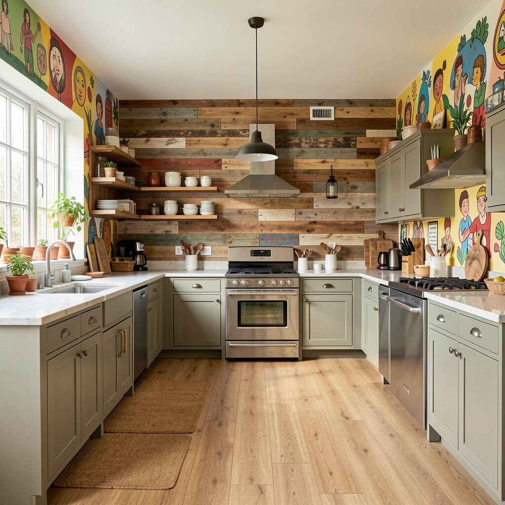
A vintage kitchen layout feels extra special when the mural is paired with reclaimed textures. Think reclaimed wood on a feature wall, topped with colorful painted motifs that look like old posters found at a market.
This benefits your style because the room gains warmth even before you add decor. Keep the layout practical by using classic storage like deep drawers, pull-out spice organizers, and a steady utensil rail. Personalization can be as simple as matching the mural colors to your favorite mugs and cookware finishes.
For cost considerations, reclaimed wood can be sourced in small boards to reduce expense, and the mural can be applied as a large decal or painted section. Current trends often celebrate imperfect textures, so slight knots and varied grain can make the mural look even more authentic. Pair the warm wall with light cabinetry and a clean tile backsplash to balance richness.
16. Floor-to-Ceiling Mural Accent With a Simple Cooking Loop
Floor-to-Ceiling Mural Accent With a Simple Cooking Loop
When the mural runs floor-to-ceiling, it can turn the whole kitchen into an immersive scene. Build the layout around a simple loop, with the fridge, sink, and stove in a neat, predictable pattern.
This layout is beneficial because it keeps cooking efficient even while the room feels artistic. Use solid, easy-clean surfaces for counters so the mural remains the focal point without visual clutter. For personalization, add a small spotlight kit aimed at the mural so evening lighting makes the colors glow.
To keep cost manageable, you can choose a mural design that uses fewer layers of color and relies on strong outlines. Then spend more on quality lighting, faucet hardware, and drawer slides that improve everyday comfort. Trends right now favor dramatic wall art with restrained furniture, which makes your kitchen feel designed rather than decorated.
17. Floating Counter Wall With Mural Behind the Sink
Floating Counter Wall With Mural Behind the Sink
Floating counters feel modern and airy, and they let a mural behind the sink take center stage. Imagine washing dishes while colorful brushstrokes behind you brighten the routine.
This benefits cleanliness because floating surfaces can be easier to wipe, and you can keep the underside clear for sweeping. Choose a backsplash that’s easy to clean, then align the mural edges so it looks planned rather than pasted. For practical tips, install a pull-out faucet spray and keep the sink accessories in a tray so the area stays tidy.
To personalize, use mural colors that match your dishware, like bright greens for leafy themes or soft blues for calm water-inspired scenes. Cost considerations are often lower when you focus on one mural wall and keep the rest of the kitchen straightforward. If you’re installing yourself, wall-mounted mural panels can reduce labor and speed up the refresh.
18. Open Corner Bar With a Colorful Beverage Mural
Open Corner Bar With a Colorful Beverage Mural
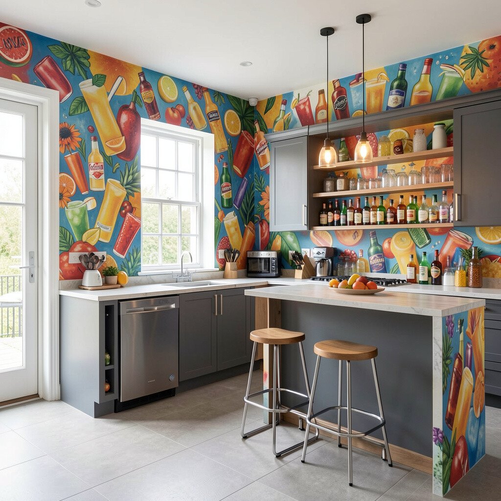
An open corner bar setup can be a fun way to add personality without overcrowding the kitchen. Place your mural on the corner wall with a beverage theme, then keep the bar counter clear and styled with a few repeat items.
This benefits everyday hosting because drinks and snacks stay within reach while the main cooking line remains uncluttered. Choose a countertop material that handles spills well, like sealed stone or a durable composite, and use matching glass storage for a clean look. For personalization, add a chalk marker recipe board on the side of the bar where you can update your weekly menu.
To manage cost, keep cabinet work minimal and invest in smart organization like pull-out drawers for napkins and mixers. Current trends lean toward “small stations,” where coffee, tea, or cocktail prep has its own space. A mural that matches your beverage style makes that station feel like part of the art, not just storage.
19. U-Shaped Kitchen With a Center Open Garden Shelf
U-Shaped Kitchen With a Center Open Garden Shelf
Combine a functional U-shaped kitchen with an open center shelf that looks like a mini garden. Fill the open shelf with planters, ceramic bowls, and colorful jars that echo your mural, creating a living visual line through the room.
This layout benefits both organization and atmosphere, because open shelves feel curated when they’re not overloaded. Keep the cooking work surfaces on the inner edges of the U, and place your sink where the light is best for rinsing and clean-up. For practical tips, use matching plant pots and rotate decor weekly so the shelf stays fresh without constant buying.
For personalization, select mural art that includes plant-like shapes or nature-inspired patterns so the shelf and wall blend naturally. Cost considerations are easier here because you can keep cabinetry standard and focus on one well-designed open shelf plus a mural feature. Trends show people loving biophilic details, and even a few planters can make the kitchen feel healthier and calmer.
20. Theater-Style Kitchen With Clear Lines and a Mural Spotlight Effect
Theater-Style Kitchen With Clear Lines and a Mural Spotlight Effect
Create a “theater” feel by keeping furniture and counters in clean lines while treating the mural like a main scene. Use lighting that frames the wall, so the colors look vivid, even on cloudy days.
This layout benefits focus because your kitchen feels intentional rather than busy. Keep the open space wide between the cooking zone and dining area, and use simple chairs that don’t visually block the mural. For personalization, add a small tray stand near the seating that holds a repeating color accent, like a bright fruit bowl or a patterned napkin stack.
To keep costs under control, prioritize one high-impact mural and quality lighting, since both make the space feel upgraded fast. Choose paint colors and finishes that work with your mural palette, so you don’t need to buy too many matching accessories. When you follow current trends, you’ll often see bold walls paired with minimal surfaces, which is exactly what helps this layout feel open and artistic.