11+ Bold Graphic Designs To Inspire Your Creativity
The first thing you notice in great graphic design is usually a feeling. That feeling can be built from color, shape, and smart choices working together.
When you see a strong layout, you start thinking of your own next move. Let these ideas nudge you toward bolder work you can make with what you have.
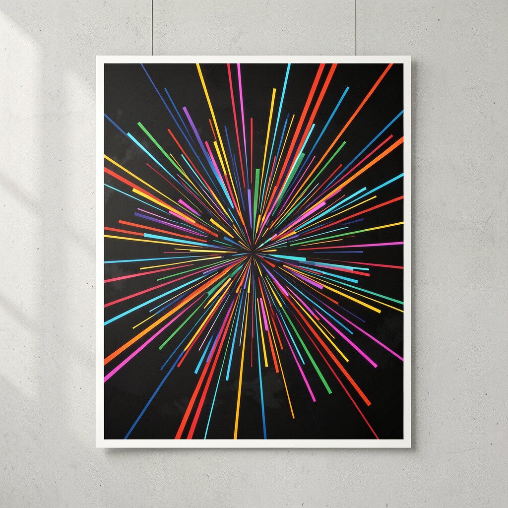
Big, bold lettering that seems to move can instantly grab attention. Imagine thick type with stretched letters, sharp arrows, and motion-like blur that still stays readable.
Use this style to show energy for events, bands, or even personal projects. Start by choosing one headline, then repeat small fragments of the word as if they’re traveling across the page.
Keep the background simple so the letters do the talking. Try a limited palette like black, white, and one bright color to control the look.
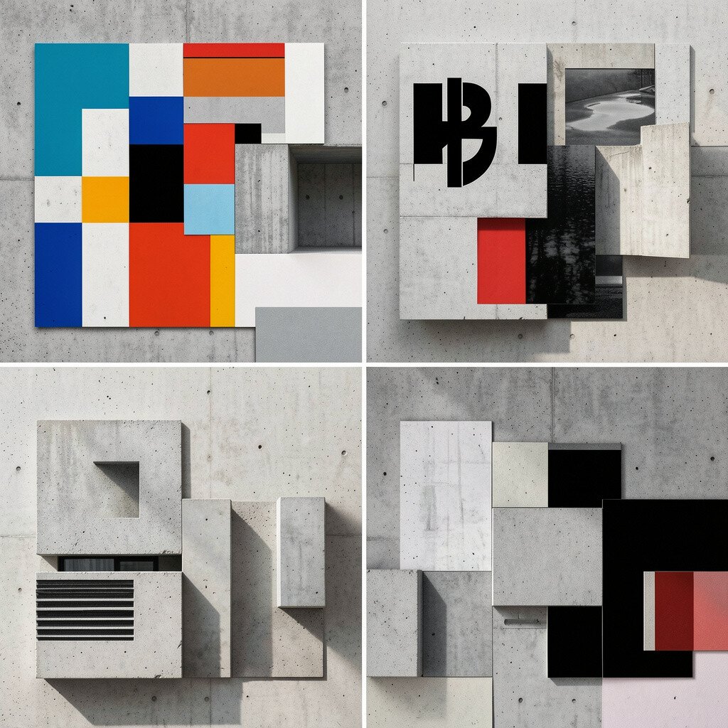
2. Brutalist Collage Layouts
Brutalist Collage Layouts
Think of torn edges, misaligned blocks, and layered textures that feel like they were assembled in a real studio. You can build it from scans, print scraps, and bold shapes that overlap with confidence.
This design style helps you say something without needing perfect symmetry. It also makes your work feel personal because the “imperfections” look intentional.
Use contrast to keep it readable, like placing dark elements over light ones. For a practical workflow, gather a small pack of images, then cut them into consistent shapes so the chaos feels organized.
If you’re on a budget, use free textures, your own photos, and photocopy-style effects in a simple editor. To personalize, swap the theme, like using ticket stubs for a music brand or grocery flyers for a community zine.
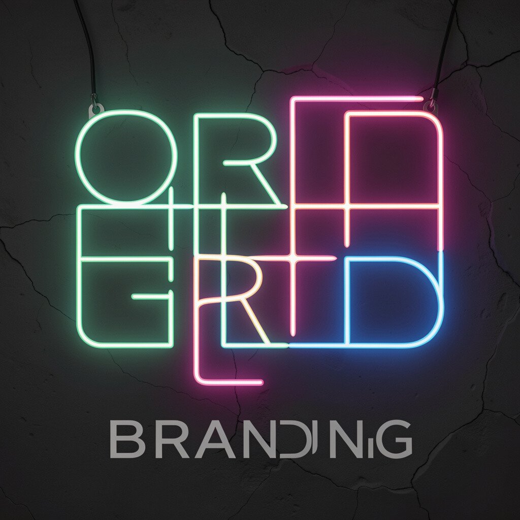
3. Neon Grid Branding
Neon Grid Branding
A neon grid can look like a futuristic city map, all bright lines and glowing intersections. Picture a tidy grid pattern with electric accents that outline key words and guide the eye.
This approach is great for tech, fitness, and nightlife because it feels modern and upbeat. It also gives you a structure, so your layout stays clear even when you add bold colors.
Keep the grid subtle by using thin lines and lowering opacity for the base layer. Then highlight only one or two areas with stronger glow effects to avoid visual noise.
For practical creation, build the grid once, then reuse it across posters, social banners, and website sections. Personalize it by swapping grid spacing, corner styles, and the glow color based on your brand mood.
Simple line icons paired with solid color shapes can look friendly and bold at the same time. Picture clean black sketches, then big rounded rectangles behind them like playful signs.
This style benefits small business branding because it feels warm and easy to remember. It also works well for instructional graphics since icons stay instantly recognizable.
Start by drawing a set of icons on paper, then scan and clean the lines in an editor. Use one or two color blocks per icon so your series feels consistent across a whole collection.
If you want current energy, lean into soft gradients and slightly imperfect edges that feel handmade. To keep costs low, use basic tools, free icon brushes, or phone camera scans of your sketches.
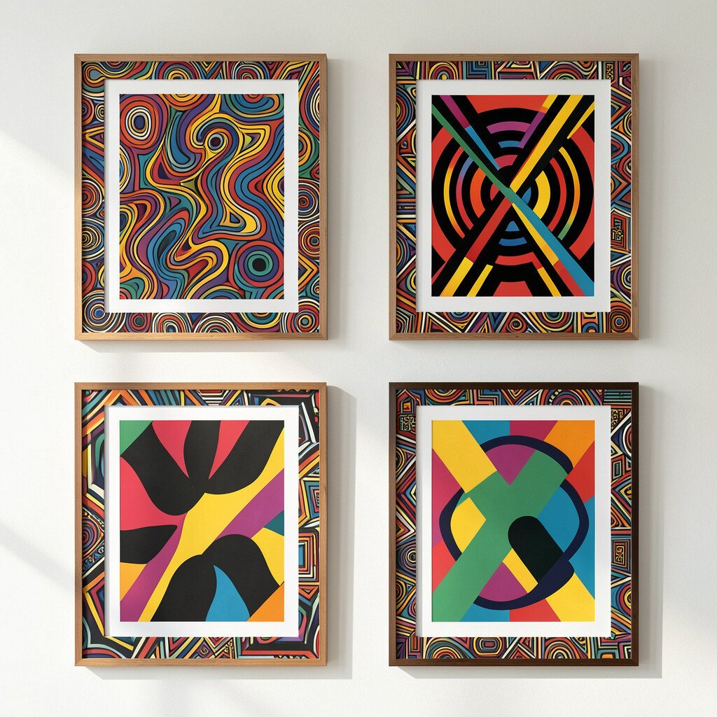
5. Patterned Poster Frames
Patterned Poster Frames
A bold poster frame can turn your design into a whole scene. Imagine a thick border made of patterns like dots, stripes, or tiny symbols, with the main message sitting inside like artwork behind glass.
This design helps your message feel curated and it gives viewers a clear place to look. It’s also unique because the frame can become your signature across multiple posters.
To make it practical, choose one repeating pattern and keep the scale consistent. Then add a strong headline in a single font weight so it pops against the patterned border.
For cost considerations, you can create patterns with simple shapes in vector software or even by hand and digitizing them. Personalize by matching the pattern to your audience, like using sport shapes for a league or floral motifs for a cafe.
6. Split-Color Photo Duotones
Split-Color Photo Duotones
Duotone designs take a normal photo and turn it into a bold graphic statement. Picture two vivid colors replacing the shadows and highlights, with clean edges and high contrast.
This style benefits social media because it looks modern even when the content is everyday. It also helps you build a consistent brand look across many posts.
Pick a duotone pair that matches your personality, like teal and magenta or orange and blue. Keep skin tones and key details readable by adjusting contrast and not over-saturating everything.
To create it quickly, use a duotone effect in common photo tools, then refine the colors with a limited palette. Personalize by choosing a different duotone pair for each campaign while keeping the same overall contrast level.
7. Surreal Shape Typography
Surreal Shape Typography
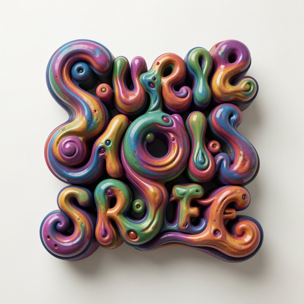
When letters are built from shapes, they can feel like a puzzle you want to touch. Imagine a word cut out of circles and triangles, where each letter is filled with a different mini pattern.
This approach is unique because your typography becomes the design, not just the text. It also gives your layout a sense of imagination, which is great for music, art events, and creative communities.
Choose one word, then decide which shapes fill it based on the vibe you want. For a practical tip, keep the letterforms thick enough so small shape details don’t disappear at small sizes.
Current trends lean toward playful mashups, so try mixing geometric fills with one organic texture like paper grain. If cost matters, you can make shape fills using basic vector tools and reuse them across multiple posters.
8. Asymmetrical Magazine Covers
Asymmetrical Magazine Covers
An asymmetrical cover layout feels bold because it breaks the “centered rule” most people expect. Picture a headline sitting in the top corner, a large photo taking most of the space, and a few headlines floating like stickers.
This style benefits your design practice by teaching hierarchy and balance through intentional imbalance. It also looks great for announcements since it can fit lots of info without getting cluttered.
Use one strong grid and then break it once, like shifting a photo block or moving the typography stack. Keep the type sizes varied but aligned to a consistent baseline system.
For practical personalization, swap the shapes of the side elements, like circles for a playful brand or sharp lines for a serious one. If you’re working with limited resources, use one high-quality photo and let the typography carry the rest.
9. Magnetic Poster Systems
Magnetic Poster Systems
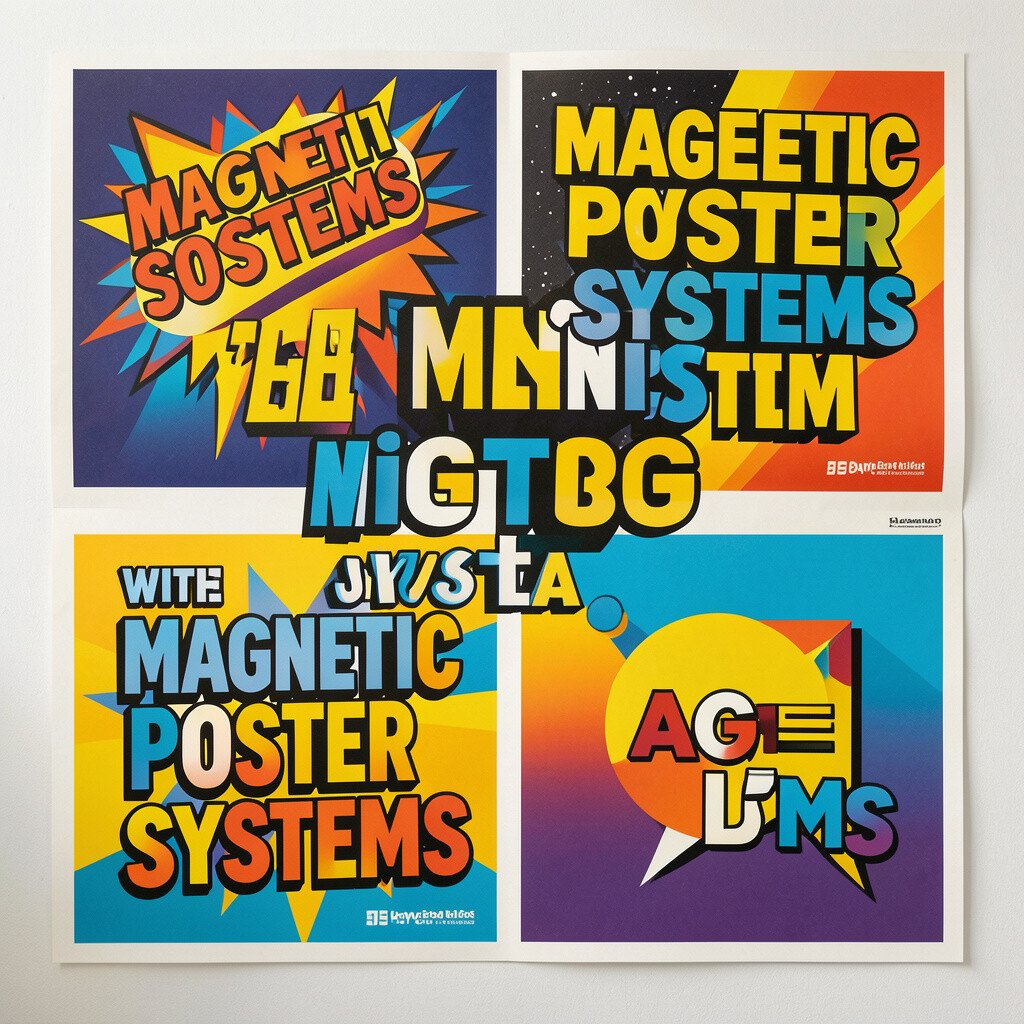
Magnetic poster systems make viewers feel like pieces can move around and rearrange. Imagine big blocks of type with subtle “hold” marks, plus small labels and icons scattered as if they’re stuck to a board.
This design can be especially fun for workshops, maker fairs, and learning spaces. It also benefits brand recall because the layout feels like an actual object, not just a screen graphic.
Start by creating a repeatable layout template with three to five element types. Then treat each poster like a new arrangement, mixing the blocks while keeping the rules consistent.
To keep costs low, reuse your own photos and icons, then vary only the block positions and colors. Personalize it by naming each element group in your head, like “headline magnet” or “photo magnet,” so your system stays organized.
10. Minimal Layout With One Loud Element
Minimal Layout With One Loud Element
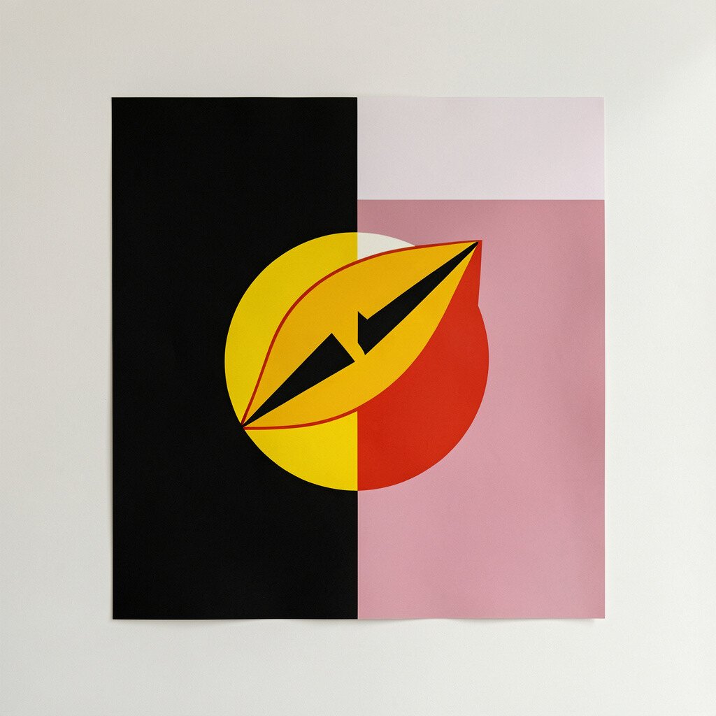
Sometimes bold means restraint, like a clean layout with lots of breathing room and one loud visual element. Picture a near-white page, a small cluster of text, and then a single oversized shape that grabs attention immediately.
This style benefits clarity because viewers know exactly what to read first. It also helps beginners since it’s easier to control than busy designs.
Pick one element to amplify, such as a huge letter, a thick underline, or a bright accent line. Keep the rest calm by using a small palette and a simple font choice.
For personalization, tie the loud element to your theme, like using an oversized leaf shape for an eco brand. If you’re mindful of cost, you can produce this look with basic shapes and standard fonts and avoid heavy image editing.
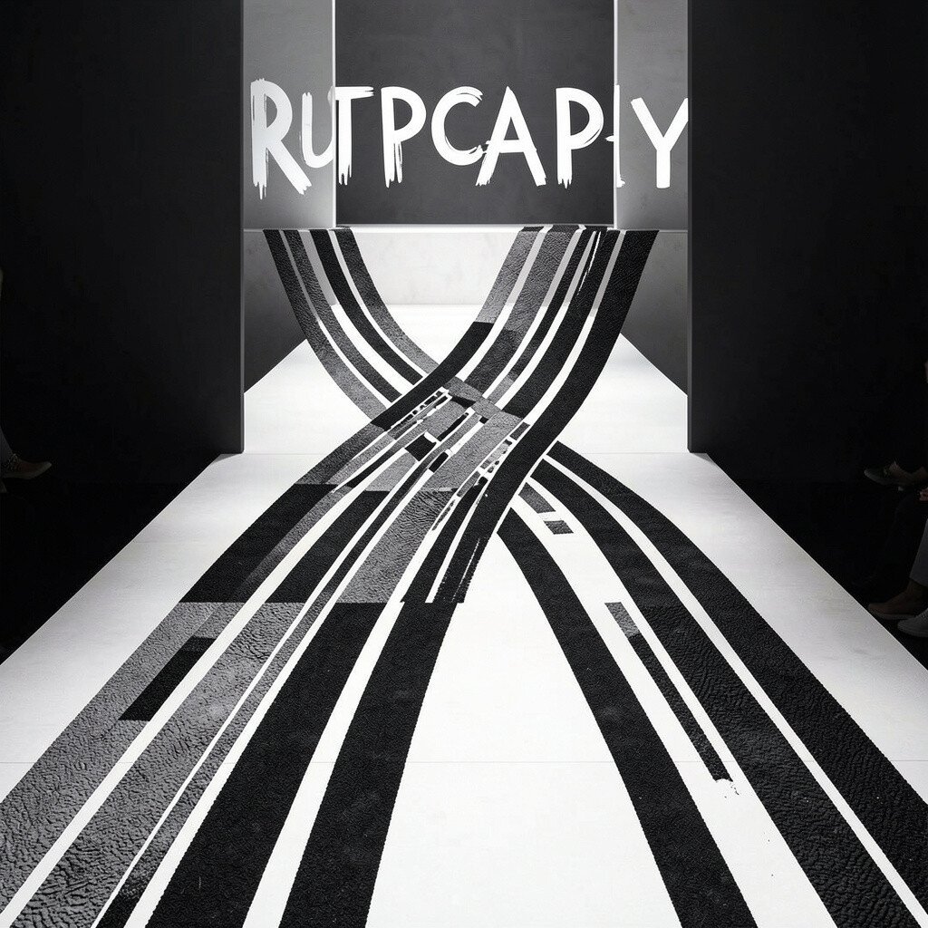
11. Typography Runway With Texture Trails
Typography Runway With Texture Trails
A runway-style typography layout feels dramatic because it pushes words forward like a stage. Imagine long lines of text that curve across the page, with textured trails like paint streaks or charcoal smudges behind the letters.
This design benefits storytelling because it encourages the eye to travel. It also feels unique when the texture matches the message, like gritty type for a documentary or smooth ink for a fashion label.
Use one main font and one texture style to keep it cohesive. A practical tip is to add texture only to the motion path or highlight area so the whole page doesn’t get muddy.
For current trends, try pairing modern clean type with slightly messy organic textures for a contrast that feels alive. Personalize it by using textures you make yourself, like rubbing paper with a pencil, then scanning the result.
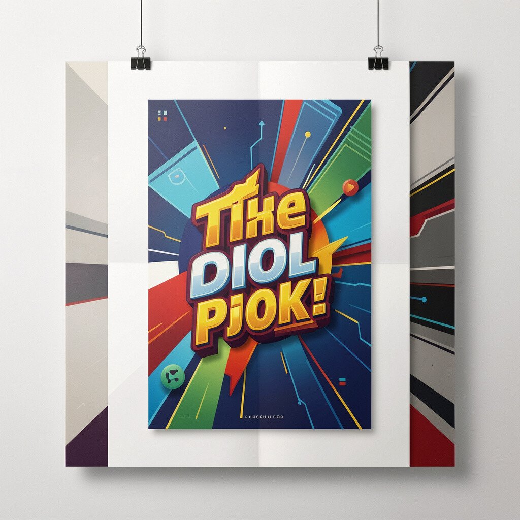
12. Interactive-Looking Posters With Layered Depth
Interactive-Looking Posters With Layered Depth
Layered depth posters create a feel of interaction, as if elements float at different distances. Picture stacked shapes, overlapping circles, and subtle shadows that make the design look almost touchable.
This style benefits digital and print because it adds depth without needing complex animation. It also makes your work feel modern, since viewers already expect layered visuals in today’s apps.
To make it practical, choose a light source direction and keep shadows consistent across every layer. Then use only a few layers with clear spacing so the poster stays readable.
For cost considerations, you can simulate depth using simple shadow presets, gradients, and basic blur tools. Personalize the look by changing the layer colors and spacing for different series, like “calm blue layers” for daytime content and “hot magenta layers” for night events.