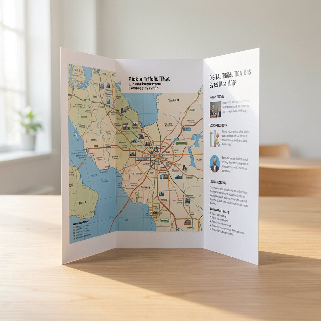
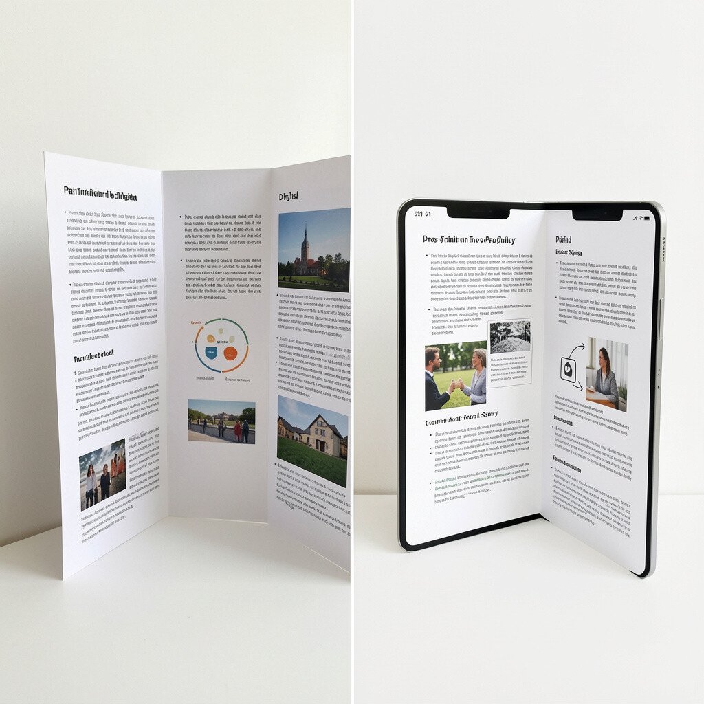
Think of a trifold board as a friendly route for your audience. When you fold it out, each panel can point to the next part of your message.
Use big headings on the left, key facts in the middle, and a clear wrap-up on the right. Keep text short and readable from a few steps away. Try pairing each panel with one main photo or icon so the layout feels balanced.
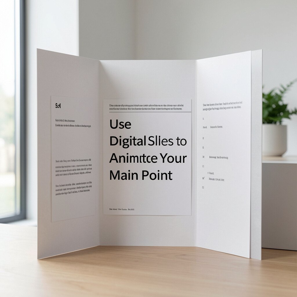
2. Use Digital Slides to Animate Your Main Point
Use Digital Slides to Animate Your Main Point
Digital presentations can add movement without adding clutter. A simple slide transition can help your audience follow your flow.
Show one visual at a time, then swap in the detail. This style works well for comparisons, steps, or timelines.
Keep animations gentle and consistent so your message stays in charge. If you use a chart, highlight one section as you speak so your audience knows what to watch. For personalization, match the colors to your topic and keep fonts the same across slides.
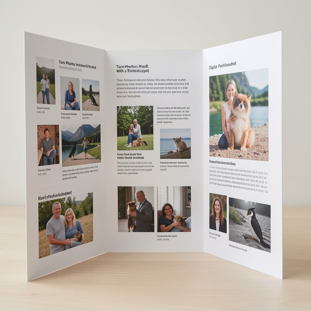
3. Turn Photos Into Proof With a Trifold Layout
Turn Photos Into Proof With a Trifold Layout
A trifold board shines when you use real images. A crisp picture can make your topic feel real and connected to everyday life.
Place your best photo at eye level and add a small caption that explains why it matters. Use contrasting backgrounds so the image stands out. If you do a project, include before and after shots on different panels.
For practical setup, print images at a high resolution and avoid tiny text that looks blurry. Consider the cost of printing and choose glossy or matte based on how bright the room will be. If you’re presenting for a class, a sturdy board and a few strong visuals often do more than lots of writing.
4. Build a Digital “Storyboard” With Simple Slide Rhythm
Build a Digital “Storyboard” With Simple Slide Rhythm
Instead of trying to fit everything on one slide, use a steady rhythm. One slide can hold one big moment, and that keeps attention from drifting.
Start with a title slide, then move through problem, evidence, and takeaway. Use consistent spacing and align elements so the design looks neat. Try adding one icon per slide to keep the theme consistent, even when topics shift.
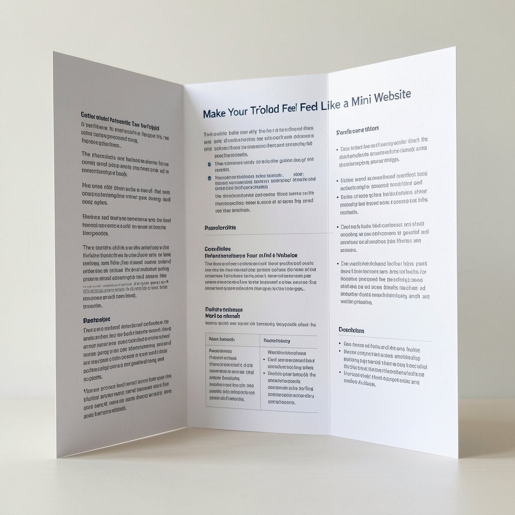
Your trifold can act like a page layout you can touch. Even though it’s paper, you can still organize it like a website with sections.
Use a color theme, such as cool blues for science or warm oranges for community projects. Put short bullet phrases in the middle panel and save longer sentences for the side panels so reading feels smooth.
To personalize, add a small “about you” corner with your name and one sentence on why you care about the topic. Keep costs low by printing only the images you really need and writing the rest by hand in neat lettering. A clean design often looks more professional than a packed one.
6. Add Audio or Voice Clips to Make Digital Presentations Human
Add Audio or Voice Clips to Make Digital Presentations Human
Digital slides can include voice recordings that make your message feel personal. Hearing your own voice is a strong way to connect, especially in a remote setting.
Use short audio clips that support your point rather than replace it. For example, you can read a key quote while the related image appears, so the audience knows exactly what to listen for.
Keep sound volume consistent across devices and test on the room’s equipment. This avoids the common problem of audio being too quiet or too loud. For cost thinking, audio tools on many devices are free or already built in, so you can spend more time on your content instead of extra software.
7. Use Tabs and Folders to Show Extra Content on a Trifold
Use Tabs and Folders to Show Extra Content on a Trifold
Trifold boards can hold more than what’s on the surface. A simple pocket made from cardstock or a small folder can store extra pages.
When someone asks a question, you can pull out a matching fact sheet. That small move makes you look prepared and gives your audience a way to go deeper without overwhelming the main display.
Keep the pocket hidden until it’s needed, so the board stays tidy. For uniqueness, add one “optional deep dive” item like a glossary card or a tiny checklist. Use lightweight materials to avoid making the board heavy, especially if you will carry it often.
8. Create a Digital “Question Hook” With a Poll or Prompt
Create a Digital “Question Hook” With a Poll or Prompt
Digital tools can start conversations fast. You can show a question on screen and ask the audience to think before you answer.
Even a simple multiple-choice prompt can make your talk feel interactive. If you’re presenting to classmates, ask them to raise hands or use reactions while you speak.
Write your prompt in plain language so it doesn’t confuse people. Keep the answer portion quick, then move to visuals that support your explanation. This trend of audience engagement helps presentations feel modern and lively.
9. Choose a Trifold Grid That Fits Your Topic Like Clothes
Choose a Trifold Grid That Fits Your Topic Like Clothes
A good trifold layout depends on what you’re presenting. A product overview works differently than a cause-and-effect story.
Use a simple grid idea so everything has a home. For instance, list features on one panel, show how it works on the next, and share results or next steps on the last.
To personalize, adapt your grid to your own style by adding small callouts next to images. You can also use color blocks to show categories, like tools, outcomes, and resources. For cost, you can use affordable paper accents or colored tape instead of expensive design prints.
10. Use High-Contrast Colors for Digital Slides So Text Pops
Use High-Contrast Colors for Digital Slides So Text Pops
Readable slides make your message easy to catch. High contrast helps your audience see words clearly even when lighting is bright.
Pair dark text with a light background, or light text with a dark background, and keep it consistent. Limit the number of colors so the design stays clean and calm. When you add diagrams, use the same color rules so your slide doesn’t look messy.
For personalization, pick colors that match your brand, school spirit, or topic mood. Test your slides on a projector if possible because screen colors can shift. This practical step can save you from last-minute surprises.
11. Add Handwritten Accents to Make a Trifold Feel Unique
Add Handwritten Accents to Make a Trifold Feel Unique
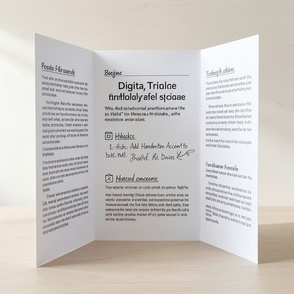
A trifold board can be more than printed graphics. Handwritten accents give it warmth and make it feel like a real person made it.
Try using neat handwriting for key lines, short slogans, or quick reflections. A little variety, like a circle around one phrase, can guide eyes without needing fancy tech.
To keep it readable, use thicker markers and keep handwriting limited to key moments. For cost considerations, you can buy a few quality markers and reuse them across projects. The trend of “human touch” designs makes paper presentations feel current and memorable.
12. Turn Data Into Simple Visuals for Digital Clarity
Turn Data Into Simple Visuals for Digital Clarity
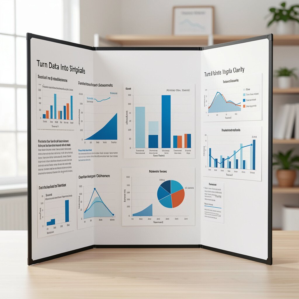
When you present numbers, visuals help people understand faster. A clean bar chart or icon-based graphic can turn stats into something easier to feel.
Instead of showing a full spreadsheet, pick the most important figures and build a simple chart. Add a short line that explains what the audience should notice most.
For practical tips, keep labels large and avoid tiny legends. If you’re using icons, make sure they match your chart meaning. This approach is a current trend because people scroll past clutter but stop for clear visuals.
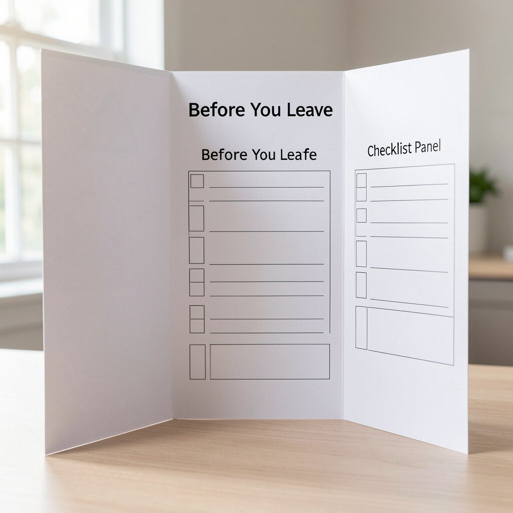
13. Build a Trifold “Before You Leave” Checklist Panel
Build a Trifold “Before You Leave” Checklist Panel
Audiences remember what you tell them to do next. A trifold board can include a final panel that feels like a takeaway list.
Use a checklist style with short items and a small icon for each one. For example, you can include steps, tips, or questions the audience can try later.
To personalize, add one suggestion that connects to your local community or your personal routine. Keep the checklist short so it stays readable and doesn’t look like a wall of text. With paper, you can cut costs by using a small number of printed elements and adding simple stickers or icons by hand.
14. Use Digital Templates But Customize the Details
Use Digital Templates But Customize the Details
Templates can save time, but personalization makes them yours. If you start with a ready design, adjust the text style and spacing to fit your content.
Change the color palette, swap in your own images, and use your topic’s theme for icons. Keep the font style consistent so the slides look designed instead of pasted together.
This is a good current trend because many tools offer built-in styles that look polished. Still, you should avoid leaving placeholder words or generic icons that don’t match your message. A thoughtful edit can make a free template look custom and professional.
15. Use a Trifold to Compare Two Options Side by Side
Use a Trifold to Compare Two Options Side by Side
Side-by-side panels are great for comparisons. A trifold board lets you dedicate one panel to each option and use the middle for the story.
Put differences in bullets and add a simple rating idea like “strong for” and “best when.” Keep the language simple so it’s easy to scan while you speak.
For uniqueness, include one mini image per option, like a logo or relevant photo, so people can visually separate them. Practical tip: use the same text length and structure for both sides so the comparison feels fair. For cost, you can print two images and reuse the same fonts and paper colors across the board.
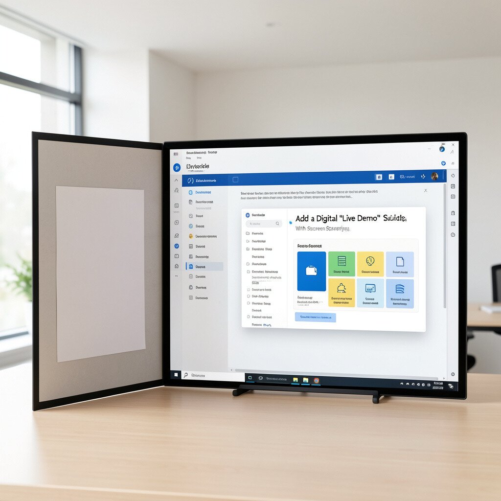
16. Add a Digital “Live Demo” Slide With Screen Sharing
Add a Digital “Live Demo” Slide With Screen Sharing
If your topic involves a tool, a live demo can be powerful. Digital presentations make it easier to show what happens step by step on screen.
Show the process slowly, and pause on the key moment so your audience can follow. Use a zoom effect or highlight circle if your tool supports it, so attention stays on the right part.
For practical tips, keep the demo short and practice the timing ahead of your presentation. Make sure you have backups in case links or logins fail. This is a modern approach people love because it feels real and not just read-aloud information.
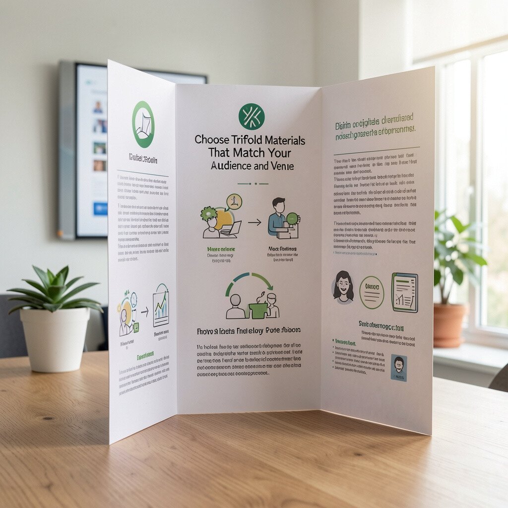
17. Choose Trifold Materials That Match Your Audience and Venue
Choose Trifold Materials That Match Your Audience and Venue
The best trifold looks great in its setting. A school classroom needs a different kind of visual setup than a bright hallway or a larger room.
Use matte prints if glare is a problem, and avoid tiny glossy stickers that reflect light. Choose a board size that is easy to carry and stands up straight when displayed. For practical tips, reinforce edges with tape and handle it carefully during transport.
For personalization, you can add small textured elements like fabric strips for a theme. Cost considerations matter, so balance the money you spend on materials with the time you spend improving the content. A neat trifold with clear writing often beats a fancy one with confusing information.
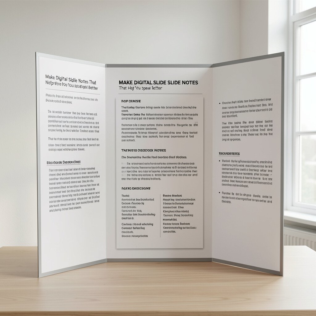
18. Make Digital Slide Notes That Help You Speak Better
Make Digital Slide Notes That Help You Speak Better
Even if slides look good, your delivery needs support. Digital tools allow speaker notes that keep your message organized.
Write short reminders, not full scripts, so you can speak naturally. Include transitions like what you will show next and why it matters, so your talk stays smooth.
For practical tips, rehearse once with the notes open and adjust the order if you run out of time. Keep your notes brief so you don’t read them word for word. Personalization can also show up here by adding your own story line or a personal moment that fits your voice.
19. Pair Trifold and Digital as a Two-Part Story
Pair Trifold and Digital as a Two-Part Story
You don’t have to choose only one format. A trifold can be your handout, while digital slides can be your speaking guide.
Start with the digital presentation to set the stage, then point to the matching panels on your trifold as you talk. This makes the audience feel guided in two ways, and it can help different learning styles.
For cost, you can keep digital simple with a few strong slides while spending more effort on the trifold visuals. This mix also supports a current trend toward multi-format communication. Personalization is easy, since your trifold can show your personality with photos, colors, and handwritten accents while your slides keep the pacing lively.