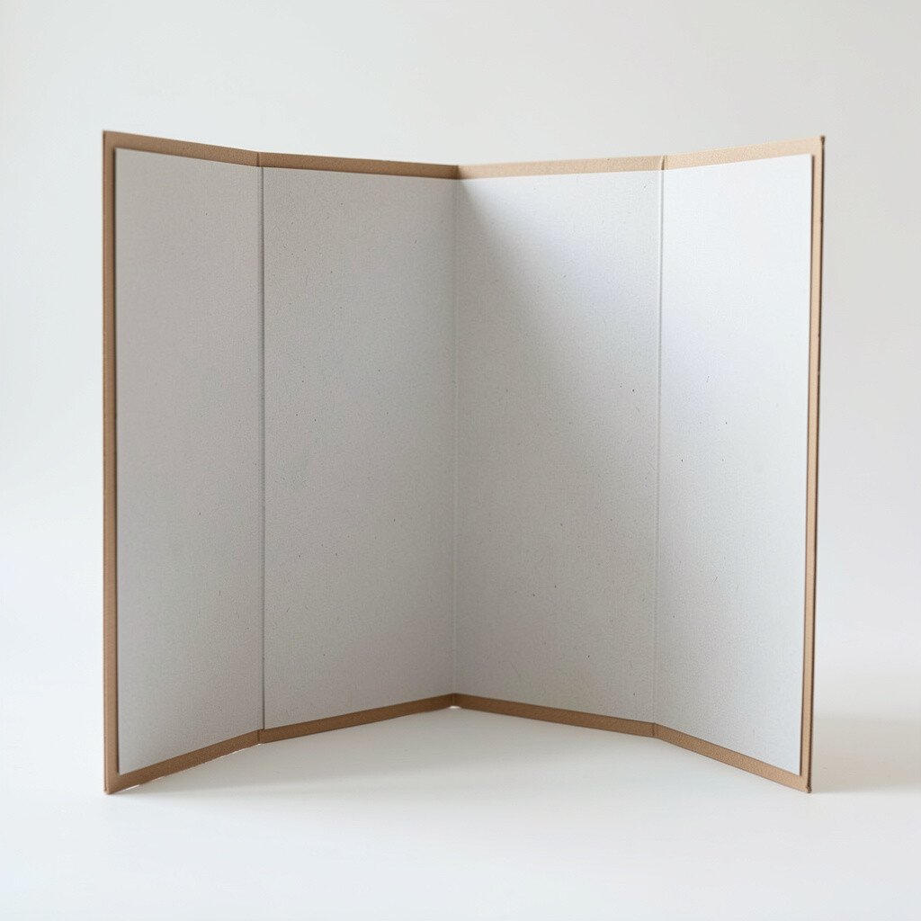
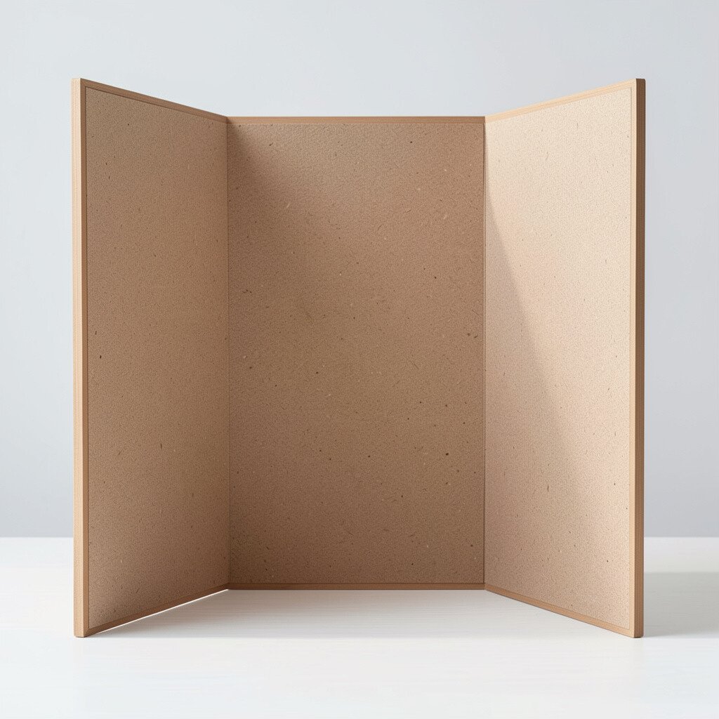
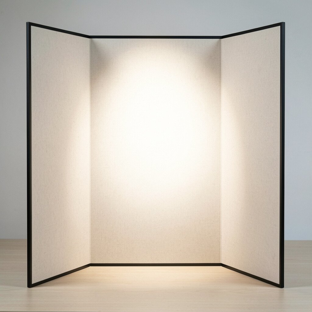
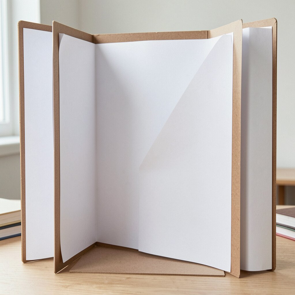
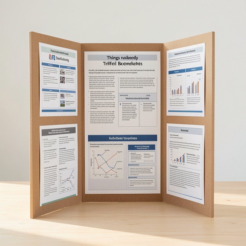
Trifold boards look simple, but they behave like tiny stage sets. Once you know their quirks, your project suddenly feels easier and more professional.
From choosing folds to styling for the room, small choices change everything. Here are practical things people rarely mention until they wish they had.
When you hold a trifold board up to the light, you can almost see how your layout will flow. If the fold direction fights your content, you will end up wrestling panels instead of presenting ideas.
Before you commit, sketch the rough order of your message and check how it moves from left to right when the board opens. Think about where the “front” panel will sit, then write down what you want people to read first.
2. Measure the usable space, not the whole board
Measure the usable space, not the whole board
The edges look clean, but the real drawing and writing area is smaller than you think. Panels overlap slightly or take up room with seams and folds, so plan for those hidden limits.
Use a simple pencil grid on the board itself so your lines land where your hands can actually reach. If you already bought materials, test one panel with a sticky note cut to size.
Leaving extra margins keeps your text from looking crowded and helps the board survive being moved around. Many people cram everything in the center and then regret it when the fold hides part of their work.
3. Treat the middle panel like the main spotlight
Treat the middle panel like the main spotlight
The middle section gets the most attention because it stays closest to the viewer when the board is opened. If your main message is tucked away on the side panels, people may miss it.
Design the center panel with the clearest title, biggest image, and simplest message. A clean visual hierarchy makes the board feel confident even if the topic is complex.
When you personalize the center, use colors that match your theme and your materials. Even a small graphic can help you guide the eye without overcrowding the board.
As a practical trick, place your most important sentence where you can read it from a short distance. That helps you know your layout is working in real life, not just on paper.
4. Beware of paper that curls around the folds
Beware of paper that curls around the folds
Some prints and cardstock look flat at first, then curl when they dry or when the board gets warm. The fold lines can amplify that effect, making your visuals look wavy.
Use heavier paper for elements that cross near the seam and press everything down carefully. If you use adhesive, choose something that dries smooth and not rubbery.
5. Choose adhesive based on where people will touch
Choose adhesive based on where people will touch
Hands naturally hover near the edges and the fold, so your glue choice matters more than you expect. If adhesive is too stiff or too wet, it can leave lumps that show up in photos.
For images on the panels, try a thin glue stick or a tape runner for cleaner edges. For thicker pieces, use a stronger method but keep it away from the fold crease area.
Test your adhesive on a scrap panel first, especially if you are layering paper. A quick test can save you from peeling and reattaching later.
And if the board will be handled a lot, add a small protective layer over the front visuals. That keeps the surface looking neat and reduces smudges from fingerprints.
6. Use one consistent font style for readability
Use one consistent font style for readability
Trifold boards often end up with too many fonts, and the whole thing starts to look chaotic. When the reader has to decode different styles, the message gets harder to understand.
Pick one main font for headings and one for body text, then keep sizes consistent across panels. A slightly larger body font goes a long way for long-distance reading.
High-contrast text improves clarity under classroom lights. Dark letters on a light background usually look crisp, even in pictures taken at an angle.
7. Plan image sizes around how folds hide corners
Plan image sizes around how folds hide corners
When you place a big image near the seam, a fold can hide part of it or crop the corner in a weird way. The board looks fine flat, then looks different once it opens and sits on a table.
Leave a small buffer from the fold, then position key visuals so they remain fully visible when the board is opened. If you want drama, use bold images on the outer panels but keep important text away from edges.
For practical accuracy, open the board and check the overlap with your hands. If you can’t see a key area, your audience will miss it too.
8. Make your color palette match the printing you can afford
Make your color palette match the printing you can afford
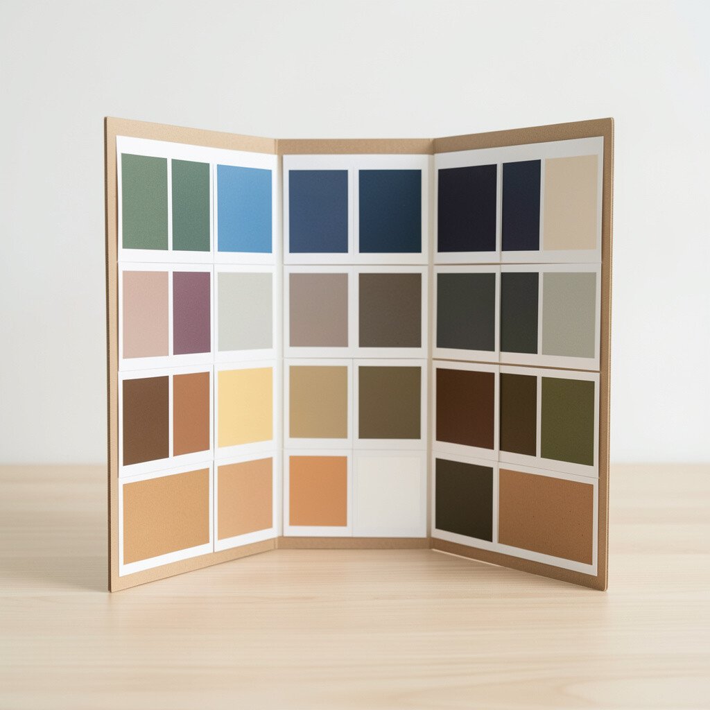
Color printers vary, and cheap ink can shift tones or make some shades look faded. That is why your palette should be realistic for the supplies you actually have.
Choose a limited set of colors and test them with one print before you run everything. You can also use colored paper shapes and markers to create accents without relying on perfect printing.
9. Turn lists into friendly sentences with breath between lines
Turn lists into friendly sentences with breath between lines
Trifold boards beg for quick scanning, but bullet-heavy layouts can feel stiff. When paragraphs are too dense, the board starts to look like homework rather than a story.
Write short sentences that sound like you are explaining your idea. Then add spacing so each sentence feels like it has room to sit.
Use connectors like “because,” “so,” and “for example” to keep the flow natural. It helps the viewer follow your reasoning even when they only glance for a moment.
10. Personalize the front panel like a mini cover page
Personalize the front panel like a mini cover page
The outside panels are your first handshake, and they set the mood instantly. A clean front panel with a clear title and one strong image makes people want to open the board.
Try adding a small themed element that matches your topic, like a shape pattern or a simple background texture. Even a hand-drawn icon can make it feel uniquely yours.
If you want personalization without clutter, use one signature color and one simple graphic style. That keeps the design cohesive while still showing your personality.
Ask yourself what a stranger should understand in three seconds. Your front panel should answer that question fast and friendly.
11. Keep your title short enough to read in one breath
Keep your title short enough to read in one breath
A long title feels smart, but on a trifold board it can wrap into awkward lines. Wrapped titles steal space from the visuals that carry your main meaning.
Try a crisp phrase and add a smaller subtitle underneath if you truly need details. Use a strong font weight for the title so it stands out against the panel background.
12. Use small “map” cues to guide the eye
Use small “map” cues to guide the eye
Even with great design, some viewers do not know where to start. A few visual cues can act like breadcrumbs that guide them panel by panel.
You can use tiny arrows, numbered icons, or a simple color match where each section belongs. If you do this, make sure the cues are consistent and not distracting.
For instance, if your center panel is about a problem, use one color theme there and carry it into the next panel. That little connection makes the whole board feel organized.
13. Think about the board as a transport problem, not just a craft
Think about the board as a transport problem, not just a craft
Trifold boards often travel in backpacks, tote bags, and car seats, which means corners take a beating. If you treat it like fragile artwork, you will prevent the common scuffs and creases.
Fold it carefully and wrap it in a protective sleeve or even a large folder. If you are using tacky adhesives, wait for everything to dry fully before moving it.
At school, keep the board away from wet surfaces and drink spills. A simple protective cover can save a whole week of work.
14. Add one interactive element that invites a touch or answer
Add one interactive element that invites a touch or answer
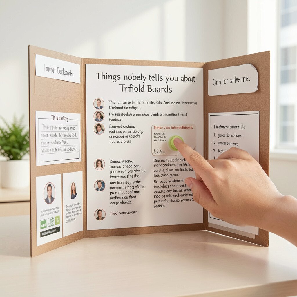
People remember projects that make them participate, even in small ways. A trifold board can include a simple interactive part that encourages attention.
Try a fold-out flap, a removable label, or a small question that fits in the space near the bottom of a panel. Just make sure the interactive part is secure and won’t fall off easily.
This kind of feature can also help you practice speaking while you present. When someone lifts the flap, you have a natural moment to explain what they are seeing.
15. Match the lighting and background of your room
Match the lighting and background of your room
A trifold board looks different depending on where it sits and how bright the room is. Fluorescent lights can flatten colors, and dark backgrounds can swallow your text.
Before the big day, hold your board near the display area and check readability from a short distance. If possible, preview a photo under the same lighting so you know what judges and classmates will see.
Choose matte finishes for printed paper to reduce glare. If you must use shiny materials, place them in areas that do not reflect light directly back to the viewer.
16. Build a reusable template so future boards cost less and go faster
Build a reusable template so future boards cost less and go faster
One of the best “hidden” advantages of trifold boards is that you can reuse your layout plan again and again. When you create a template, you stop reinventing design choices that already work.
Save your panel measurements, font choices, and color palette so you can swap in new content later. Over time, you will spend less on repeated printing and fewer materials wasted in trial runs.
Current trends lean toward clean design, bold visuals, and clear organization, so a reusable template helps you stay aligned with what looks modern. You can still personalize each project with fresh images, but the overall structure stays efficient.
For cost considerations, consider using a limited set of backgrounds and reusing cut shapes. When you invest once in a good template, every later board feels quicker, calmer, and more you.