11+ Artistic Trifold Board Displays For Photo Exhibitions Ideas
Light catches a photo differently when the presentation has personality. A trifold board can make your images feel like they are telling a story.
Instead of just arranging pictures, you can design an experience with color, texture, and smart layout choices. When you do it well, visitors slow down, look longer, and remember more.
Cover the back of your trifold with a fabric that matches your photo mood, like linen for warm travel shots or felt for cozy portraits. Stretch it smoothly, then mount the printed images with small hidden clips or neat photo corners so the edges look tidy.
The finished display will feel gentle and layered, almost like a tiny boutique gallery. Use a light spray adhesive sparingly for stability, and keep seam lines aligned so the panels look intentional.
For personalization, choose fabric scraps that echo colors in your photos, such as a muted blue from a sky or a dusty rose from clothing. This approach also helps hide small mounting marks, which is a real relief during setup.
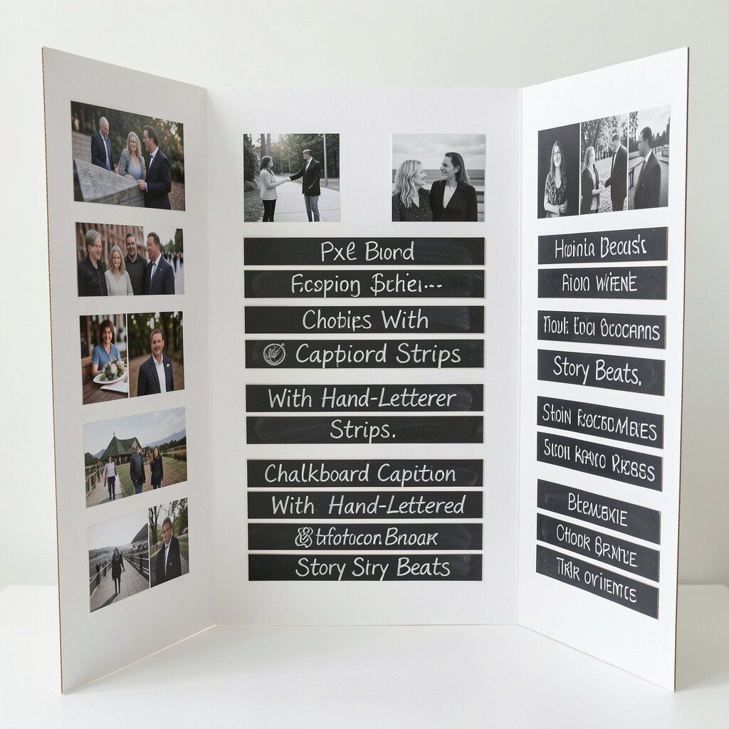
2. Chalkboard Caption Strips With Hand-Lettered Story Beats
Chalkboard Caption Strips With Hand-Lettered Story Beats
Cut thin strips of chalkboard label paper or chalkboard paint cards, then place them beside or under each photo area. Write short, friendly lines that match the moment, like where the picture was taken or what emotion it holds.
The visual contrast is striking because the dark writing space makes the images pop right away. Use a smooth chalk marker for consistent letters, and wipe gently with a soft cloth to keep things clean.
If you want easy updates, consider using erasable chalk markers so you can change the captions for different audiences. It also saves money compared with printing new caption cards every time.
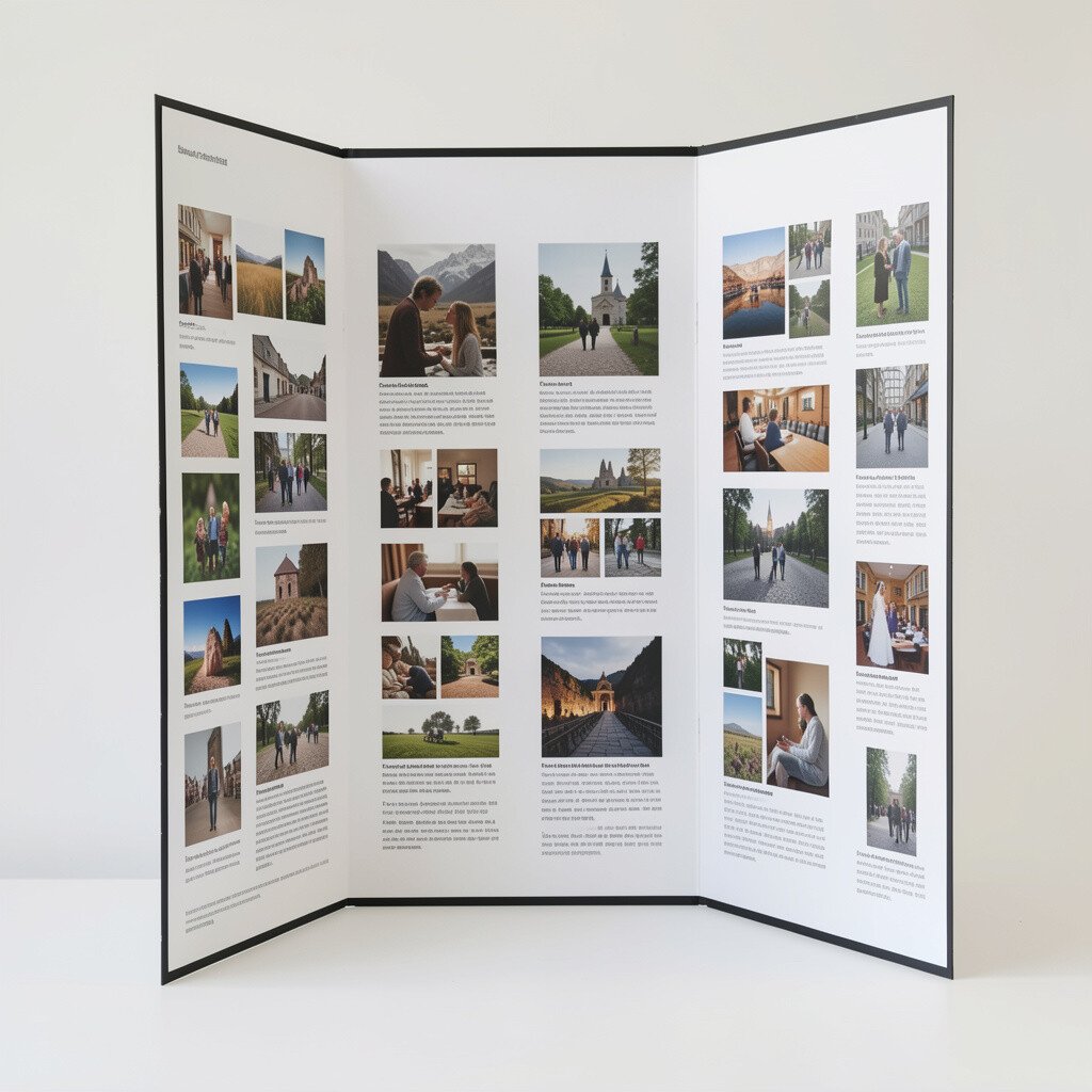
3. Matte-Black Frames With Minimalist Typography Layout
Matte-Black Frames With Minimalist Typography Layout
Turn your trifold into a modern showcase by adding matte-black paper “frames” around each photo. Keep the rest simple, using one clean font style for small headings and caption lines.
When the frames are consistent in thickness and spacing, visitors see your work as a cohesive series rather than scattered pictures. This layout also makes lighting less stressful, since matte surfaces reduce glare.
To personalize, pick a single accent color for typography, such as gold, teal, or soft silver, and repeat it across panels. For practical setup, dry-fit your frames first so your photos sit perfectly and don’t overlap when the board folds.
For cost, black craft paper is usually cheaper than buying fancy frame materials. You can also reuse the black frame pieces for new exhibitions by swapping only the photo prints.
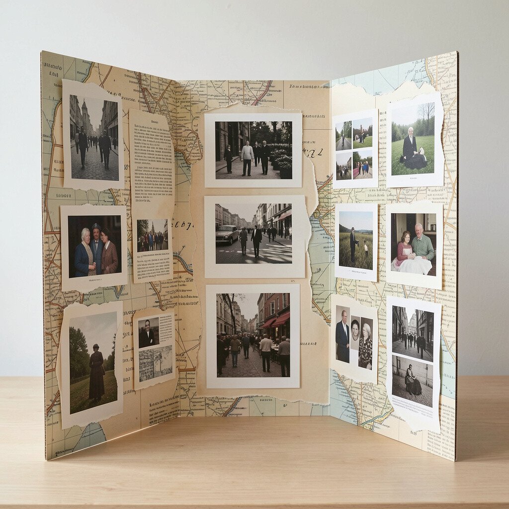
4. Paper-Relief Collage Edges Using Torn Maps and Old Book Pages
Paper-Relief Collage Edges Using Torn Maps and Old Book Pages
Create a textured border by tearing map paper, atlas pages, or vintage book sheets into irregular shapes. Layer them along the trifold edges and under photo corners so each panel looks like it has a history.
That slight “handmade” roughness adds charm, and it makes even ordinary photos feel special. Seal the paper lightly with a clear glue stick or matte medium so it resists handling.
If you want a fun twist, choose a travel theme for one side and a learning theme for another, then let the collage materials hint at both. Keep the colors muted so your images stay the star of the show.
For personalization, pick one repeated motif like tiny compass roses or page numbers, then echo that pattern across all panels for unity. Budget-wise, thrift stores and recycled paper supplies make this idea easy on your wallet.
5. Interactive Flap Panels That Reveal Details Underneath
Interactive Flap Panels That Reveal Details Underneath
Build small flaps using sturdy foldable cardstock so visitors can lift a corner to reveal hidden prints or close-up details. For example, under a wide portrait shot, place a smaller texture study or the same scene in a different crop.
The visual impact is playful and memorable, because people naturally want to touch and look. Use strong scoring on the fold lines so the flaps open smoothly without cracking.
This format helps you present a series with both overview and depth, which is great for photo essays. It also supports practical communication, since you can include process notes on the underside for those who want context.
To personalize, match the flap direction to your story flow, such as opening left to right. If you are worried about wear, reinforce corners with transparent tape on the fold, which is a low-cost fix.
6. Transparent Overlay Color Washes Over Photo Sections
Transparent Overlay Color Washes Over Photo Sections
Add a creative layer by placing semi-transparent colored acetate sheets over part of each photo panel. Choose colors that echo the subject, like warm amber over sunset shots or cool blue over night scenes.
The result looks like light filters through glass, and it gives your images a dreamy, artistic glow. Keep the overlays consistent in opacity so the board looks polished instead of messy.
For practical tips, trim acetate neatly and mount it with removable tape so you can adjust it for different prints. This is also a fun way to test color ideas without reprinting everything.
7. Accordion Strip Timeline Along One Fold
Accordion Strip Timeline Along One Fold
Use an accordion-style strip to display a timeline of your photo series along one of the trifold’s folds. Insert small photos or contact-sheet style crops so the sequence feels like turning pages.
Visitors can follow the story without reading long text, and that makes the exhibit feel friendly. Keep each segment the same width so the accordion motion stays smooth during setup.
To personalize, include date stamps, short location notes, or simple checkmarks that show progression. If you want current trends, consider “micro-storytelling,” where each small image holds one key moment rather than a long description.
8. Layered Cutout Silhouettes That Frame the Main Shot
Layered Cutout Silhouettes That Frame the Main Shot
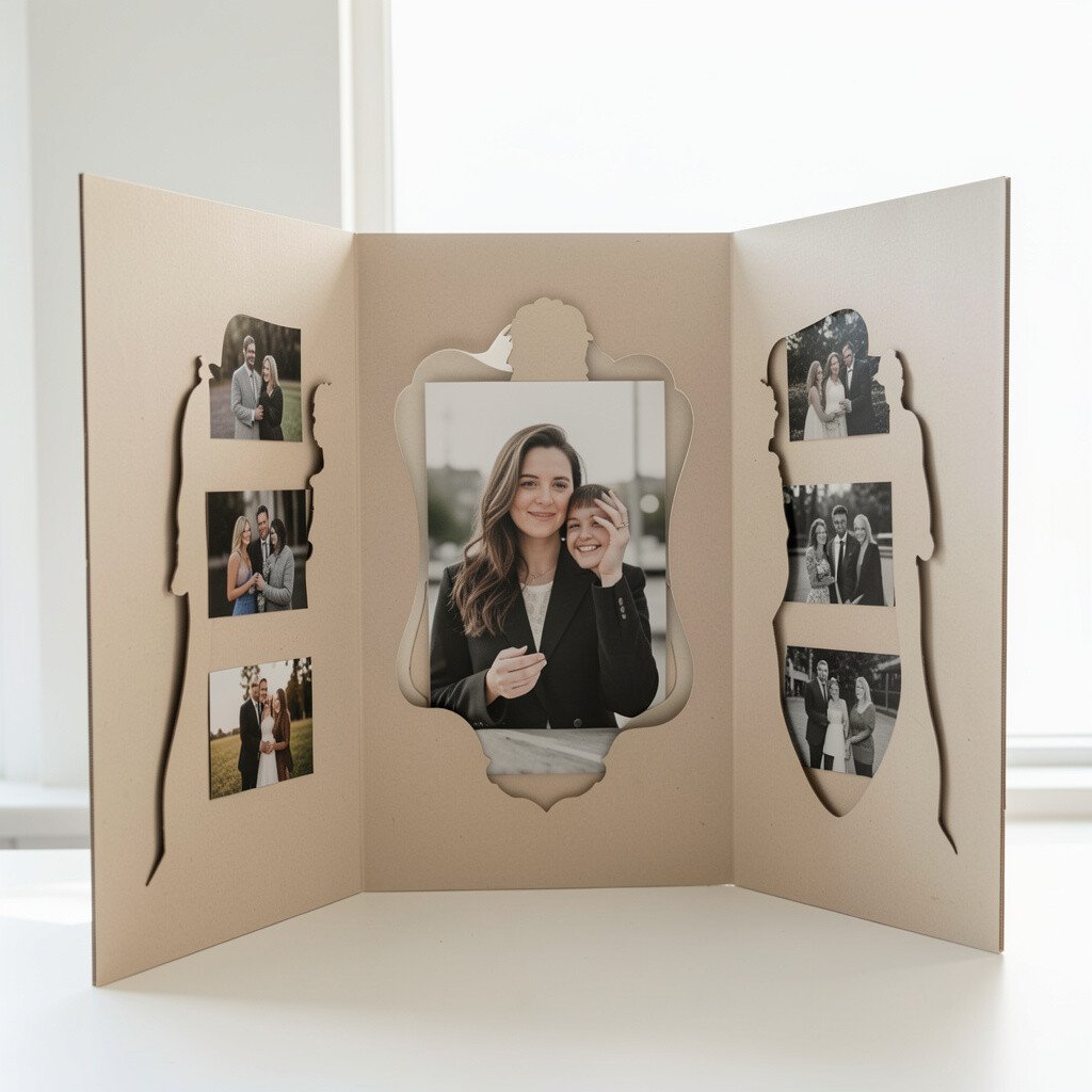
Cut out bold shapes from cardstock, like mountain outlines, window frames, or leaf silhouettes, and place them around your main photos. The cutouts create a graphic frame that still lets the image remain clear and central.
This display style adds uniqueness because the silhouette becomes its own art layer. It also helps with organization, since the cutout shape guides where each photo belongs.
For practical tips, choose a thick cardstock so the cut edges hold their form when the trifold folds. You can also paint or wrap the cutout with a matching color so everything looks intentional.
To personalize on a budget, use black cardstock for a dramatic look or patterned paper for a playful feel. The materials are usually easy to find, and you can reuse the same cutout frames for future sets.
9. Shimmering Metallic Tape Lines for “Light Path” Composition
Shimmering Metallic Tape Lines for “Light Path” Composition
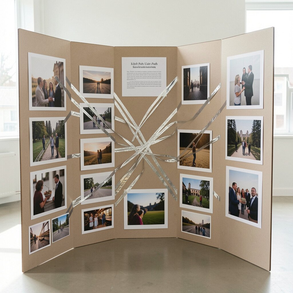
Use metallic craft tape to draw gentle lines that “point” toward key parts of your photos. Think of it like light paths guiding the eye, such as a curved line from the corner toward a face or a horizon.
The bright lines make the composition feel dynamic, and they look especially good in well-lit exhibition rooms. Keep the tape widths consistent and use short segments if you want a more modern, airy feel.
For personalization, match the tape color to your photo accents, like copper for warm tones and silver for cool tones. This is a trend-friendly approach because minimal design with one bold highlight is common in current gallery styling.
10. Reclaimed Wood Texture Panels With Scenic Photo Overlays
Reclaimed Wood Texture Panels With Scenic Photo Overlays
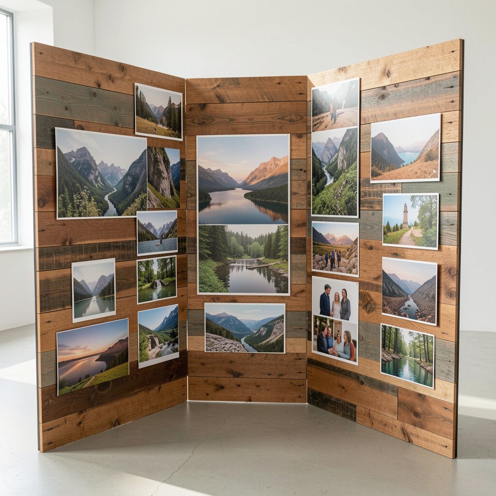
Create a rustic look by attaching thin textured sheets that resemble reclaimed wood, or by using craft paper printed with wood grain. Then place your photo prints on top with clean spacing so the texture frames the images without overpowering them.
The warmth of wood makes landscapes, street photography, and family portraits feel grounded and welcoming. It also adds depth, which can reduce the “flat” look that some boards get under bright lights.
For practical tips, avoid thick layers that make the board bulky at the fold, and test the closing motion before fully adhering. If you need to keep it sturdy, use a double-sided mounting method that keeps photos flat.
In terms of cost, you can cut down spending by using one wood-texture sheet across all panels, then varying photo sizes. Personalize by adding a tiny brass pin or twine loop near one corner of each panel, echoing a natural theme.
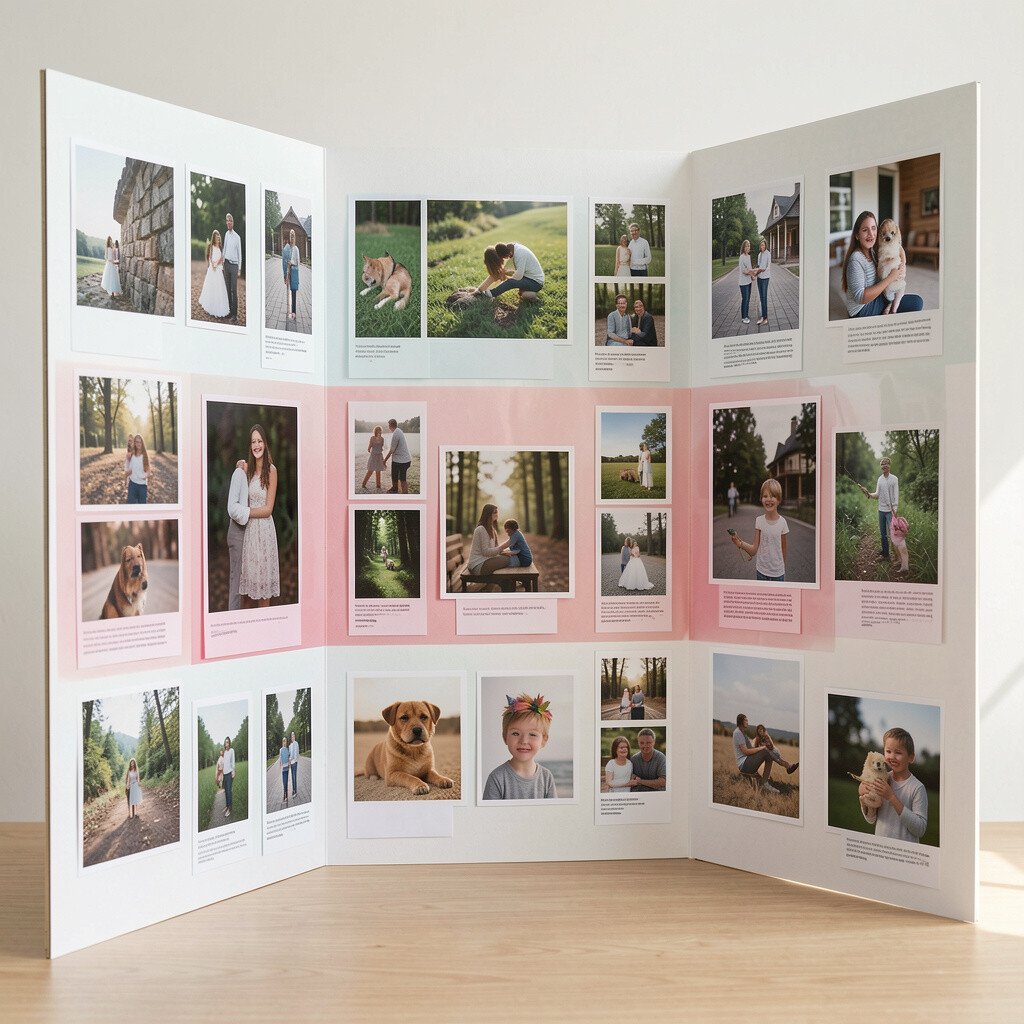
11. Hand-Painted Watercolor Backdrops Behind Each Image
Hand-Painted Watercolor Backdrops Behind Each Image
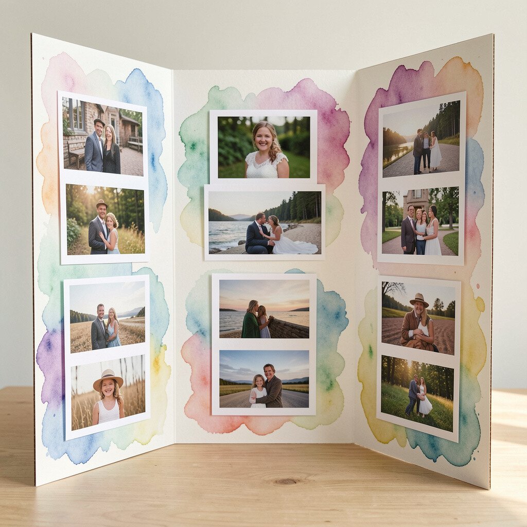
Paint watercolor washes directly onto the trifold panels, letting colors bleed gently around the photo areas. Choose palettes that match the images, such as soft greens for nature or muted purples for moody portraits.
This technique makes the display feel artistic right away because each panel becomes part of the artwork. It also helps your photos blend smoothly with the board instead of looking like pasted rectangles.
To personalize, create a repeating color rhythm across the three sections, like the same warm tone appearing in every panel. For practical tips, let the paint dry fully and protect the surface with a light matte varnish so smudges don’t happen during handling.
12. Magnetic Pinboard Layout With Swap-Friendly Photo Cards
Magnetic Pinboard Layout With Swap-Friendly Photo Cards
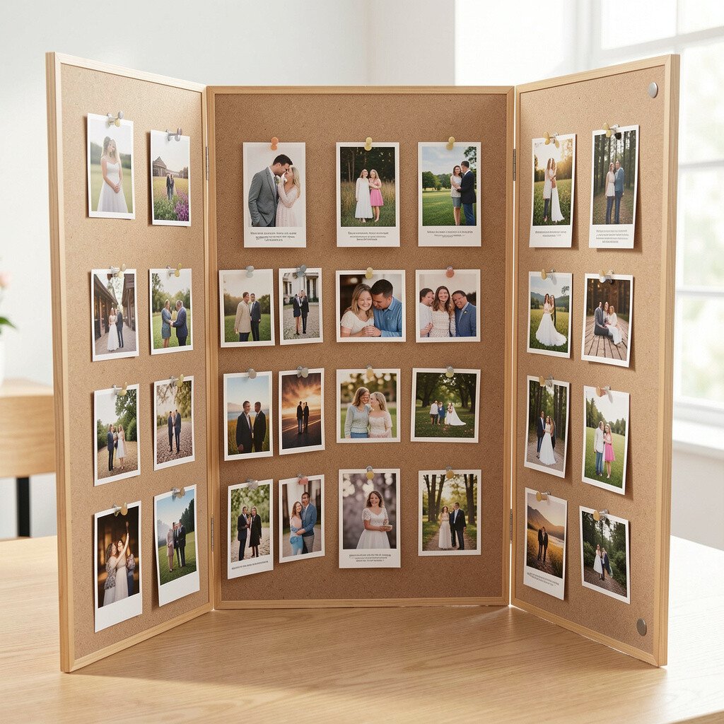
Use a pinboard or fabric-covered surface with small magnets or magnetic photo corners so you can swap prints quickly. Mount the board with a thin magnetic layer, then place photos on removable cards that stay aligned.
This setup is great for exhibitions where you might change your lineup, and it reduces stress during transport. It also gives you a polished look because all prints sit in consistent positions.
To personalize, add themed magnets or small metal icons that match your series, such as tiny stars for night themes. For cost considerations, magnetic corners and small steel sheets are often less expensive than repeatedly printing entire boards with fixed mounting.
And if you want a practical way to plan, print a few preview grids on plain paper first so your spacing looks balanced before you buy final photo cards.