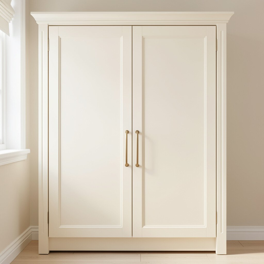
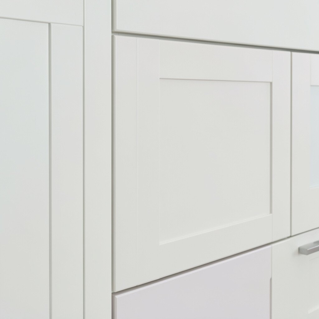
Warm white cabinets make a room feel brighter while still looking soft and lived in. They play nicely with natural light and give walls a gentle glow instead of a harsh glare.
Pick a warm white with a slight creamy undertone to avoid that icy, sterile look. Pair it with matte black hardware and light wood shelves for a cozy contrast. This choice is unique because it looks different at different times of day, shifting from creamy morning to airy evening tones.
2. Soft Greige For Balanced Beauty
Soft Greige For Balanced Beauty
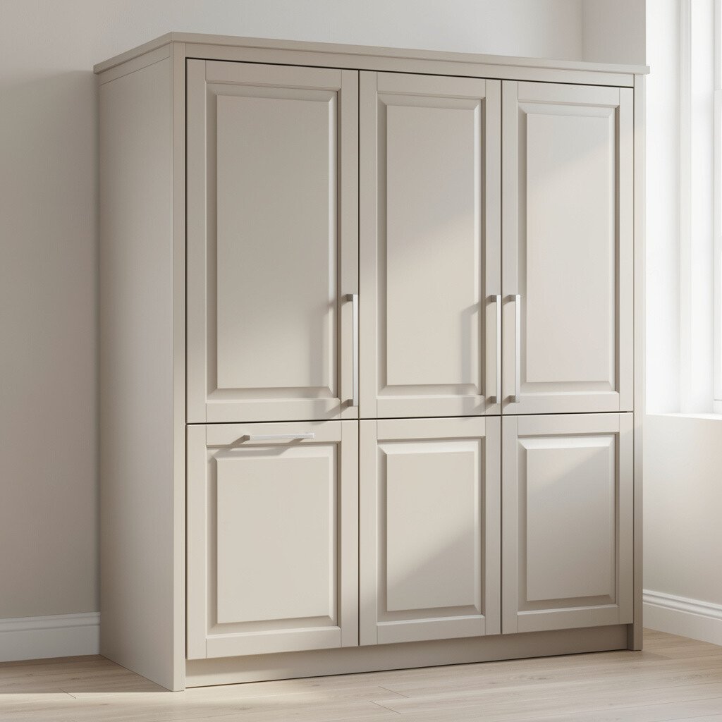
Soft greige sits between beige and gray, so it feels steady and welcoming. You get a modern mood without the coldness that some grays bring.
Choose a greige that leans slightly warmer if your floors are honey or oak. It hides minor scuffs better than many lighter paints, which is a real everyday benefit. To personalize, match the undertone with your countertops, then repeat it through a runner rug or small decor pieces.
For a practical finish, use a cabinet paint with a durable sheen like satin. If you want the look to feel fresh, add slim crown molding or updated pulls that match your faucet. This color also stays current, since greige continues to be a favorite in modern kitchen styling.
3. Gentle Sage For A Relaxed Kitchen Mood
Gentle Sage For A Relaxed Kitchen Mood
Sage colored cabinets bring in a calm, earthy vibe that feels like fresh air. It’s a quiet color that still looks special when sunlight hits it.
Try sage in a satin finish for a smooth, easy-to-clean surface. Use brass or brushed nickel hardware so the green tone feels friendly instead of vintage. This is an appealing alternative because it offers uniqueness without the loud energy of bold green shades.
If you have warm stone like travertine or cream quartz, sage will look like it was made for it. A simple way to personalize is to bring in one accent color, such as terracotta planters or a woven basket. For cost considerations, lighter paint jobs are often less expensive than replacing cabinetry, and sage can be achieved through a repaint with quality prep.
To keep it balanced, avoid pairing sage with super cool gray walls. Instead, choose warm off-white paint for the surrounding trim and ceiling areas.
4. Classic Sand For A Beachy Yet Clean Style
Classic Sand For A Beachy Yet Clean Style
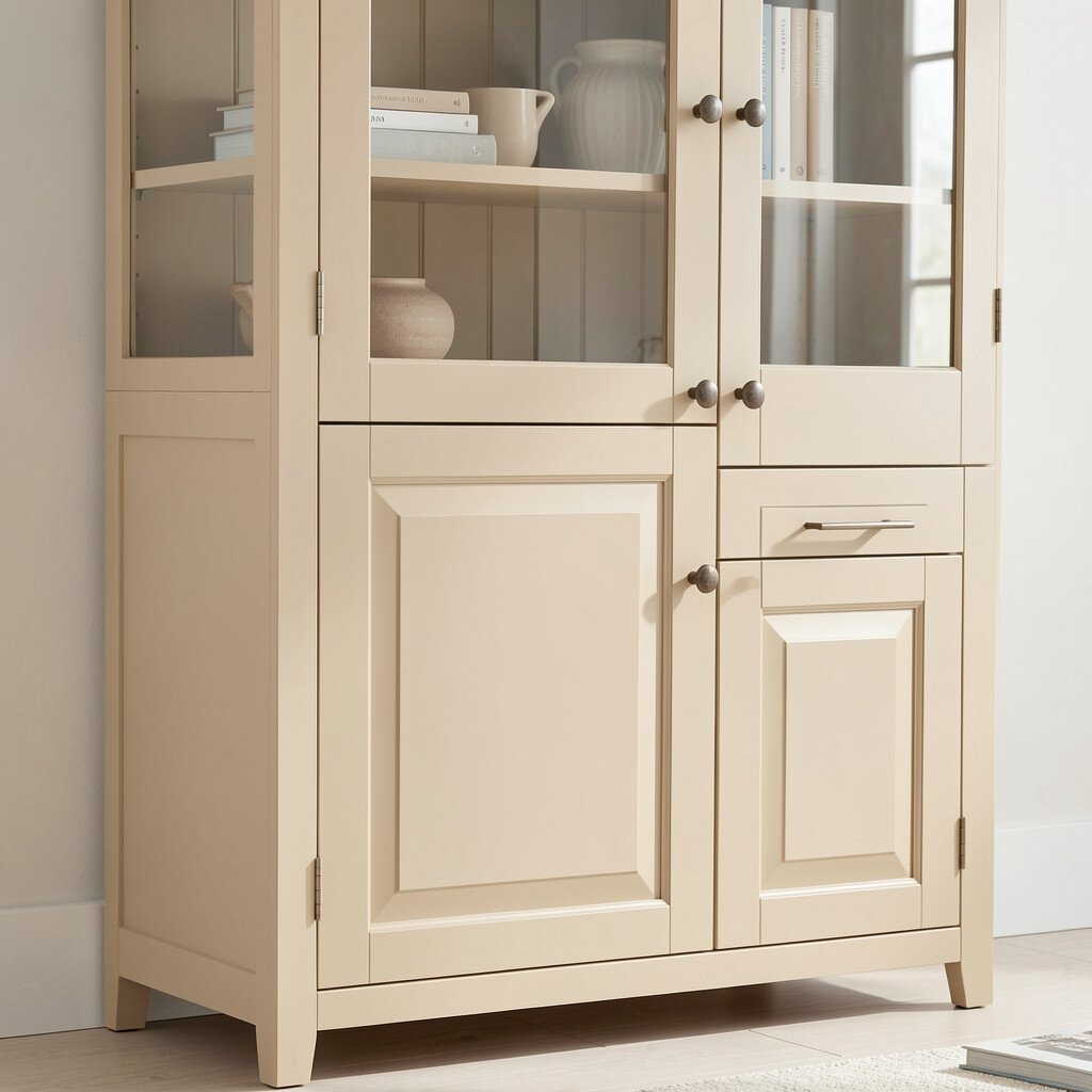
Sand colored cabinets give a sandy, sunlit feel without going full beach theme. The look is airy and friendly, and it makes even smaller kitchens feel open.
Pick a sand tone with subtle golden warmth so it flatters wood floors. This color helps hide everyday mess because the tone is forgiving. Pair it with white countertops and woven textures like rattan canisters for a practical, lived-in finish.
5. Muted Blue Gray For A Cool, Modern Edge
Muted Blue Gray For A Cool, Modern Edge
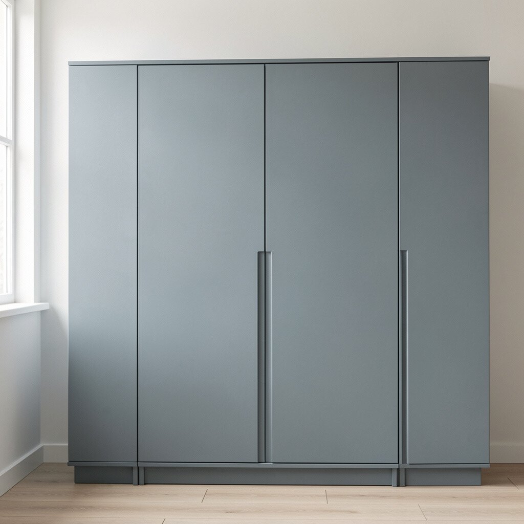
Muted blue gray cabinets add a gentle color pop while staying calm. They look crisp, especially with bright whites and brushed metals.
Choose a muted shade that feels more gray than blue, so it’s easy to style year after year. Hardware in nickel or chrome can sharpen the look, while darker handles in oil-rubbed bronze add depth. This option is unique because it brings a modern, slightly coastal feel without looking like a painted room in a postcard.
If you want personalization, use the same blue tone in backsplash tile or a single accent wall behind open shelves. For a practical approach, keep the rest of the kitchen neutral so the cabinet color becomes the star. Cost wise, repainting is usually less expensive than new cabinets, and a muted color can help resale appeal because it feels timeless.
6. Crisp Eggshell For Soft Contrast
Crisp Eggshell For Soft Contrast
Eggshell white cabinets give you that clean, finished look with less starkness than bright white. The finish feels smooth and cozy, especially in kitchens with warm lighting.
Look for an eggshell color that doesn’t pull too yellow or too gray. This helps the cabinets stay versatile with different countertops, from marble to quartz. A practical win is that eggshell tones can make the space feel larger without emphasizing every shadow line.
To personalize, add glass-front doors on a few upper cabinets and choose subtle interior lighting. That way, dishes and glassware look extra inviting. This color choice also stays on trend because soft neutrals remain popular for whole-home harmony.
7. Deep Charcoal For Dramatic Calm
Deep Charcoal For Dramatic Calm
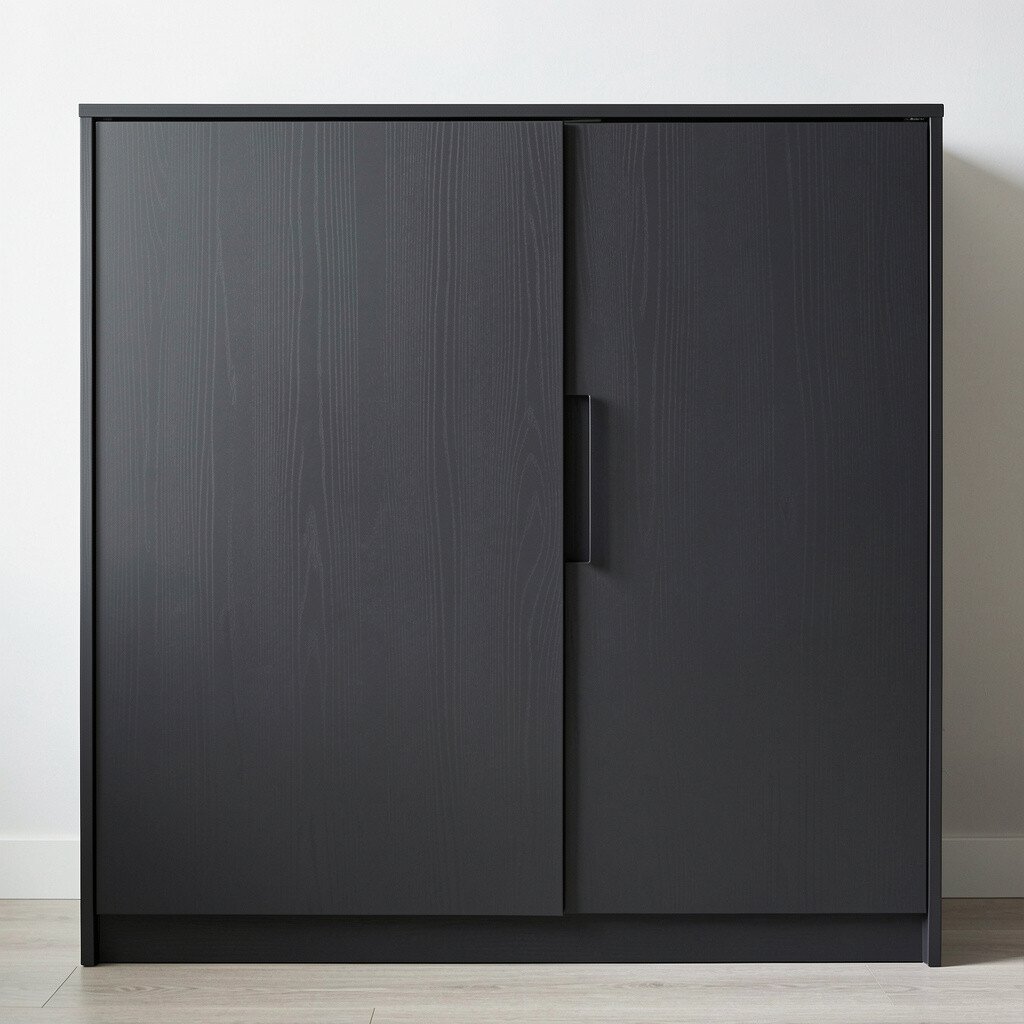
Charcoal cabinets create a bold look that still feels grounded. Instead of bright color energy, you get a dramatic, cozy mood that’s easy to pair.
Go for a deep charcoal with a smooth finish so it doesn’t look chalky. Pair it with warm white walls and a light countertop to prevent the kitchen from feeling heavy. This is unique because charcoal reads as modern and upscale, especially with sleek, minimal hardware.
For practical tips, choose a paint system made for cabinets and consider a clear topcoat for extra durability. To personalize, add brass hardware or a patterned runner that echoes the dark tone. Cost considerations are important too, because dark colors often look best with even coverage, so proper prep and multiple thin coats can save you from redo work.
8. Light Oak With Painted White Overspray Feel
Light Oak With Painted White Overspray Feel
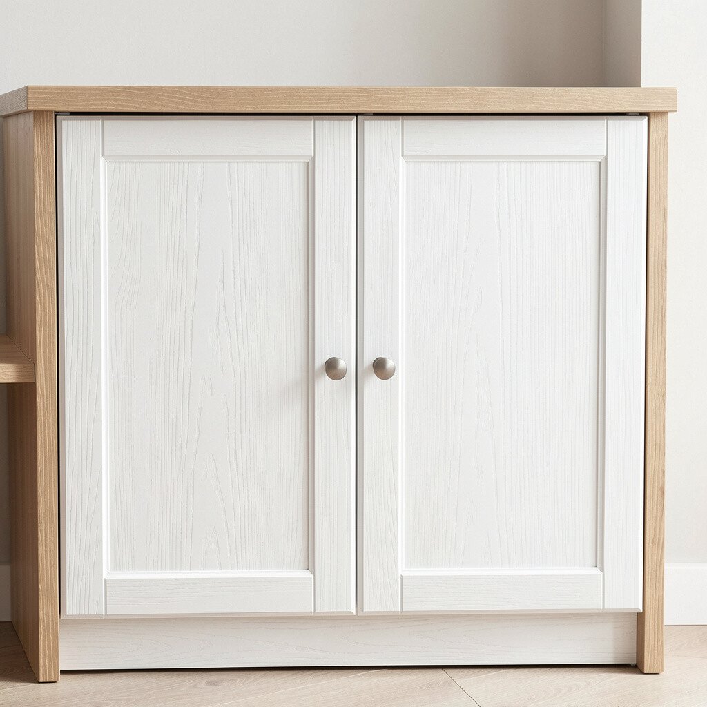
Going for a pale, creamy white over a light oak look can give you that airy, natural style. It blends warmth from wood with the fresh feel of paint.
Instead of fully blocking the wood character, aim for a look that preserves warmth and grain. This gives uniqueness because it feels custom rather than copy-paste. It also helps your kitchen feel inviting when you use natural textiles and open shelving.
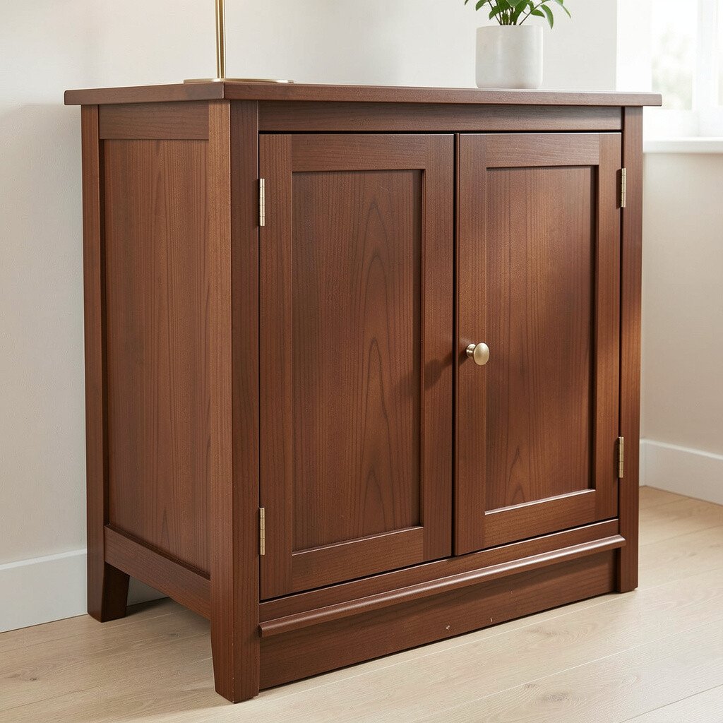
Mocha colored cabinets bring warmth and comfort without shouting. It’s a rich neutral that hides dust and everyday smudges better than very light shades.
Choose a mocha that matches your countertop undertone, especially if you have brown veining or warm stone. This color works beautifully with gold accents and warm white walls. Personalize by styling the top of the cabinets with a mix of wood cutting boards and ceramic pieces to bring the warmth to life.
For practical tips, use a satin finish to keep cleaning easier than flat paint. Mocha also fits current trends because warm neutrals are staying strong in kitchen design. If you’re budgeting, consider repainting cabinet boxes first and only replacing doors if needed, so you control cost while still upgrading the look.
You’ll also get a more forgiving surface over time, which is helpful in high-use kitchens.
10. Olive Green For Earthy Energy
Olive Green For Earthy Energy
Olive green cabinets feel grounded and stylish, like a modern farmhouse meets city chic. It adds personality without needing bright colors.
Pick a muted olive rather than a neon green so it stays calming. Pair it with white quartz, light brass, and simple hardware for a clean look. This option is unique because olive works with both warm and cool metals, letting you choose your preferred vibe.
To personalize, use olive tones in backsplash accents or dishware that you can swap with seasons. A practical tip is to keep countertops lighter, so the green stays fresh and doesn’t feel heavy. On cost, a repaint plus updated hardware often delivers a big impact without the higher expense of a full cabinet replacement.
11. Blush Beige For Gentle Romance
Blush Beige For Gentle Romance
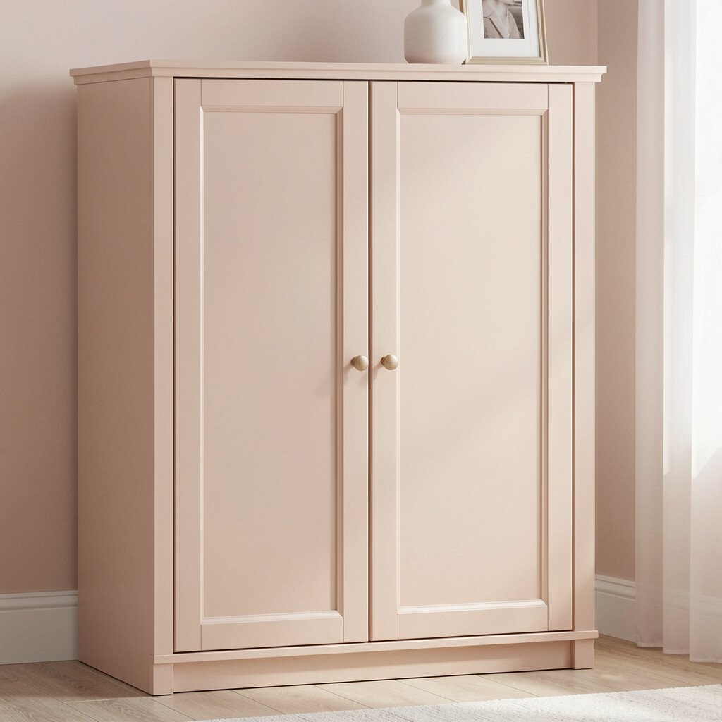
Blush beige gives cabinets a soft, rosy warmth that feels friendly and calm. It’s a great choice when you want a touch of color but still prefer a neutral foundation.
Choose a blush tone that’s subtle and mostly beige, so it doesn’t overpower the room. Pair it with warm white walls and creamy countertops for a cohesive look. This color is unique because it adds emotion and warmth without looking childish or overly trendy.
For practical personalization, style with light wood, woven baskets, and matte black accents if you like a modern edge. If you have darker flooring, blush beige can help brighten the kitchen while keeping it cozy. Cost-wise, lighter colored cabinets can sometimes hide brush marks better, but quality prep still matters for smooth results.
12. Soft White With Taupe Undertones
Soft White With Taupe Undertones
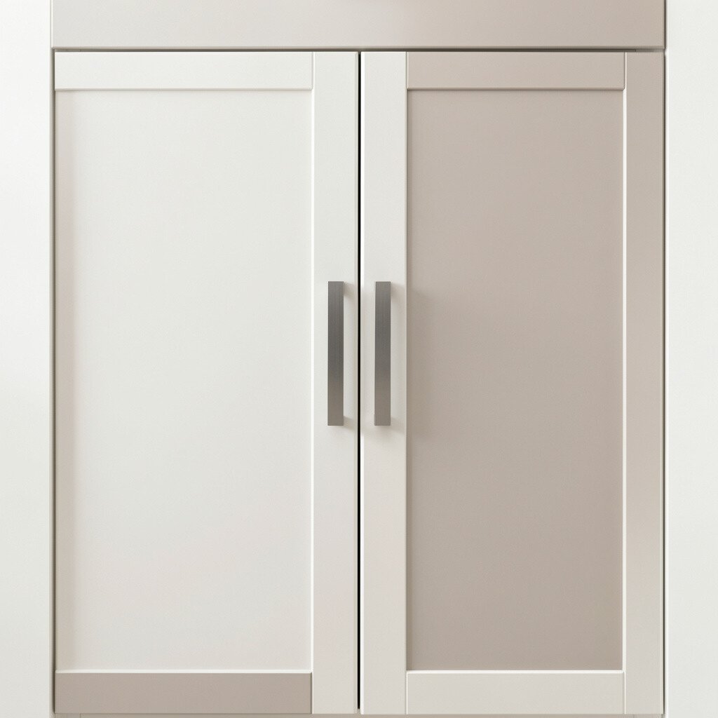
Cabinets painted soft white with taupe undertones give a refined, designer feel. It’s a nice middle ground when pure white makes things feel too stark.
Look for undertones that appear warm in daylight and neutral under evening lights. This benefit helps your kitchen stay consistent, which is especially helpful when you have lots of artificial lighting. The unique part is that taupe softens the edges of everything around it, including backsplash patterns and flooring tones.
13. Powder Gray For Quiet Modern Style
Powder Gray For Quiet Modern Style
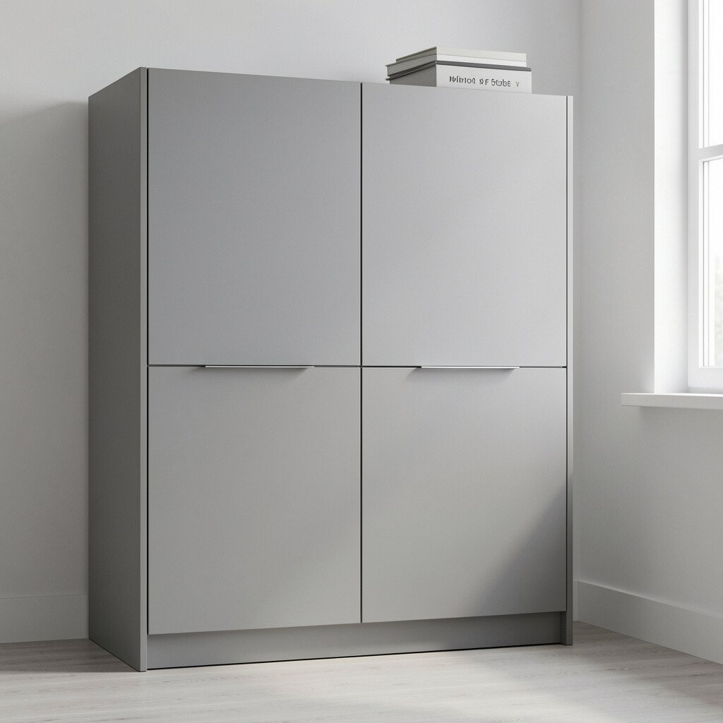
Powder gray feels modern but gentle, like a cloudy sky before rain. It adds structure to your kitchen without taking over the space.
Choose a powder gray that’s not too blue, unless you want a cooler palette. Pair it with bright white counters or warm white walls to keep it balanced. To personalize, add texture with a slipcovered bar stool or a woven light fixture so the color feels inviting.
For practical tips, use a durable enamel or cabinet-grade paint so it resists chipping and scrapes. This color stays relevant because modern gray still appears often in current design trends, especially when used in a soft, powdery shade. Cost considerations are straightforward too, since repainting existing cabinets usually costs far less than starting over with new ones.
14. Butter Yellow For Sunlight Without Loudness
Butter Yellow For Sunlight Without Loudness
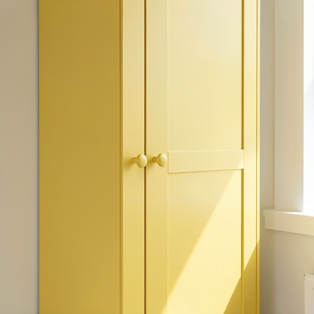
Butter yellow cabinets can make your kitchen feel like it’s always sunny. When the tone is mellow, it brings warmth without the stress of super bright colors.
Pick a butter yellow that reads creamy, not neon, so it stays elegant. Pair it with white subway tile and simple black hardware for a crisp contrast. This choice is unique because it brightens the mood while still blending with traditional and modern styles.
15. Terracotta Whisper For Cozy Warmth
Terracotta Whisper For Cozy Warmth
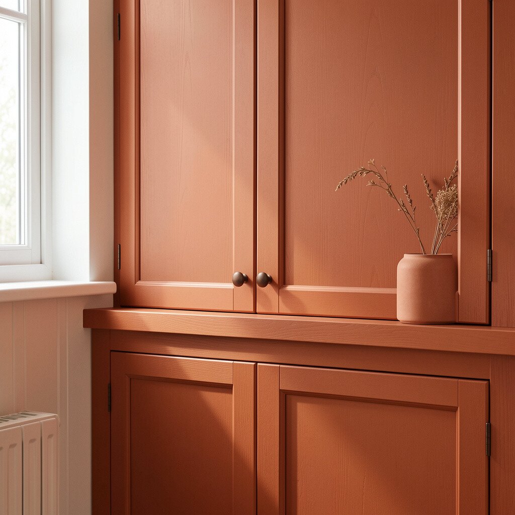
Terracotta toned cabinets bring a grounded, artisan feel that works beautifully in kitchens with earthy elements. The color adds warmth and makes natural materials like wood and stone look even better.
Use a softened terracotta, often described as clay or muted rust, to keep it wearable. Pair it with light cream countertops and warm brass hardware to highlight the undertones. This is unique because it creates a handcrafted vibe without needing rustic clutter.
To personalize, bring terracotta into small items like canisters, a coffee mug set, or a patterned dish towel that you can refresh later. Practical tips include sealing the finish well and choosing hardware that feels comfortable to use daily. On cost, terracotta can be achieved with a paint color match, and updating pulls can make the new cabinet color look intentional.
For best results, keep walls a neutral warm white so the cabinets look like the main attraction.
16. Blackened Bronze For Luxe Depth
Blackened Bronze For Luxe Depth
Blackened bronze cabinets offer a rich, metallic depth that feels luxurious. They look especially striking with warm lighting and natural wood accents.
Instead of true black, choose a dark brown-black with a bronze undertone so it won’t look flat. Pair it with creamy countertops and light backsplashes to keep the space feeling open. This option is unique because it catches the light in small ways, making every cabinet door feel dimensional.
For practical tips, go with a cabinet-safe finish and consider testing a small area first. Personalize with hardware that matches the same metal family, like bronze or antique brass, so everything feels pulled together. Cost considerations matter here too, because dark colors can show uneven coverage, so investing in proper prep and quality tools can save time and money.
If you want a trend-forward look, pair the cabinets with simple, modern lines and a minimal backsplash to let the color shine.