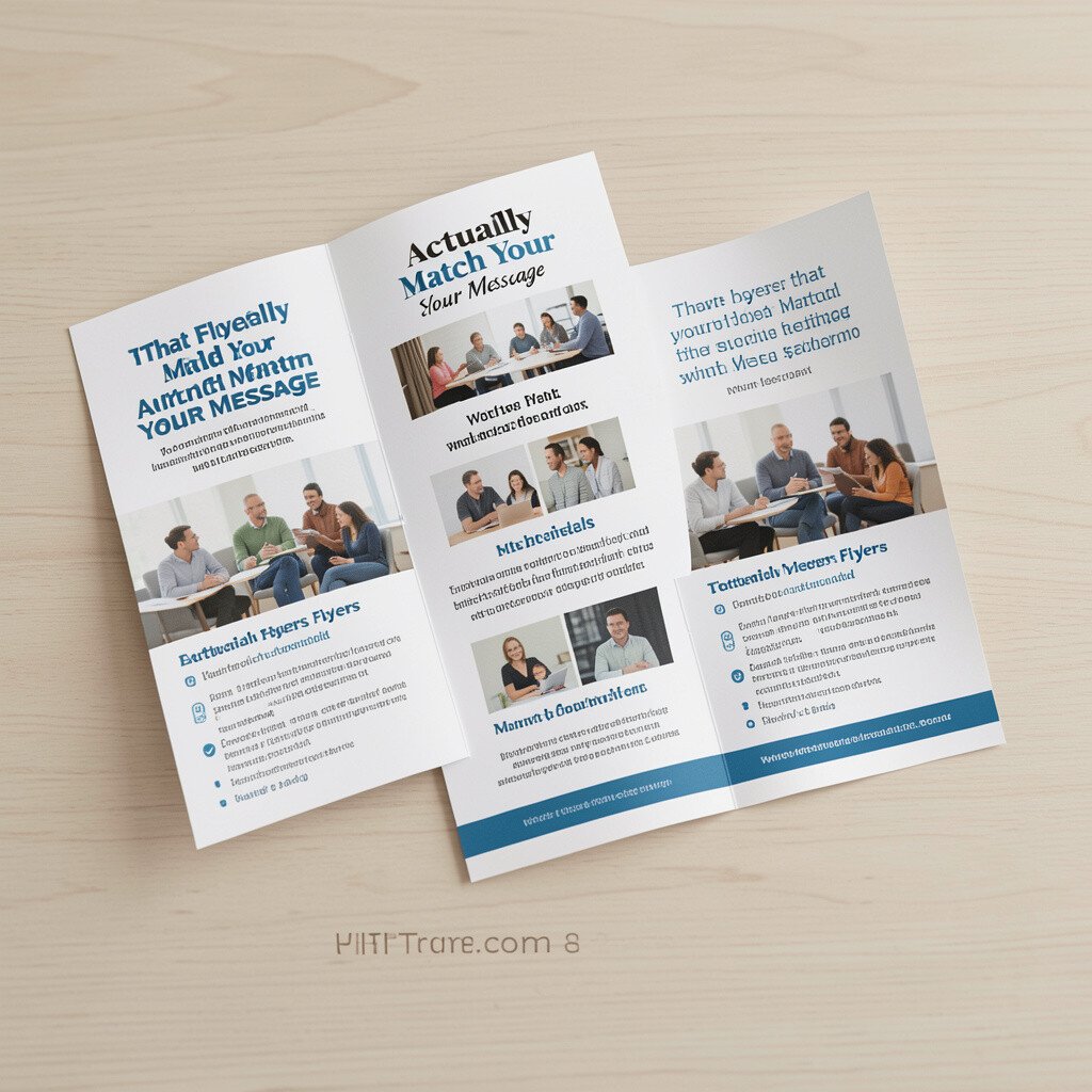
You can design a flyer that feels like it belongs with your project. Imagine thick, crisp paper and a clean fold that lines up perfectly, so the first look is tidy and confident.
Use one clear promise, one strong photo, and a short call to action that fits inside the folded space. Choose a current trend like bold color blocks or a modern duotone image, then keep margins generous so it stays easy to read in a hurry.
2. Sturdy Business Cards With Soft-Feel Finishes
Sturdy Business Cards With Soft-Feel Finishes
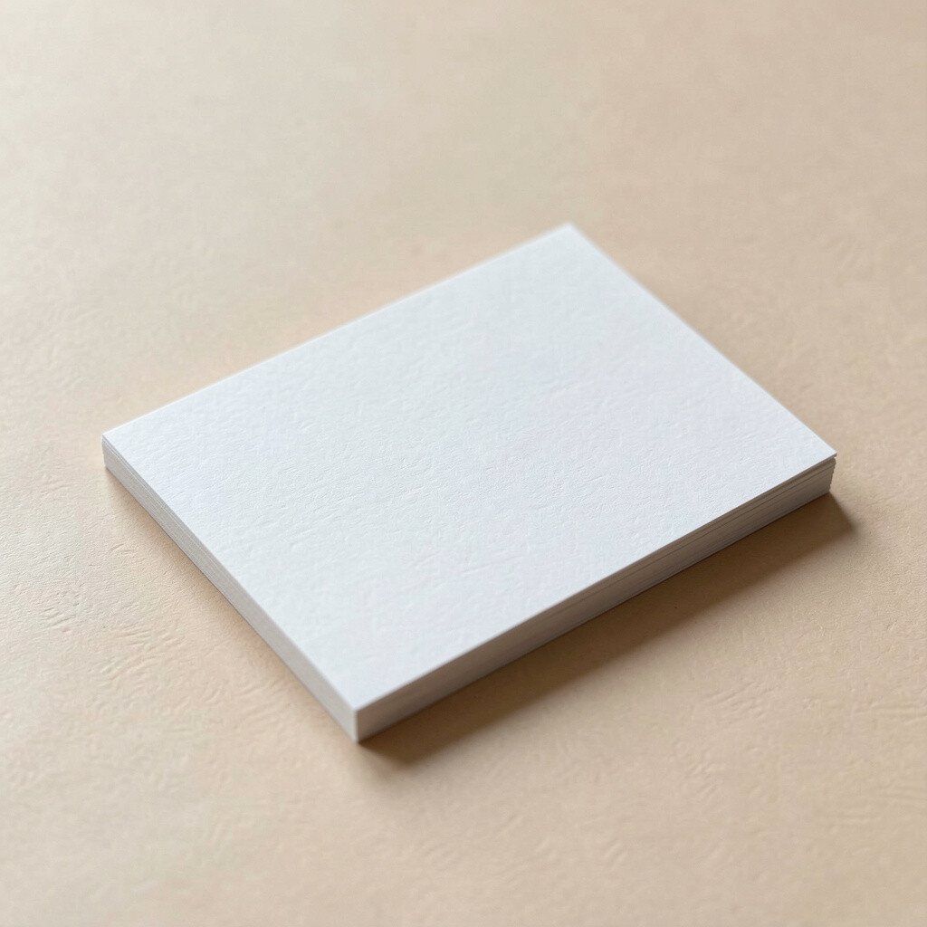
Your first impression often happens in your hands. A card with a smooth matte finish and crisp, dark text can look calm and premium, even before anyone reads it.
Keep one side simple and dedicate the other to one helpful detail, like a quick service line or a small QR for a portfolio. If you want cost control, start with a standard size and use fewer ink colors, then upgrade the finish later as you test what people respond to.
Personalize by tailoring the card design for the audience you meet, like using a color palette that matches an event theme. You can also add a tiny icon set that signals your style, which makes the card feel unique without making it busy.
3. Mini Zines for Stories, Process, and Personality
Mini Zines for Stories, Process, and Personality
A zine is small, but it can hold a lot of heart. Picture stapled pages with playful layouts, slightly varied ink density, and a cover that invites curiosity at arm’s length.
Share behind-the-scenes steps, field notes, or a short narrative that explains why you make your work. People love tangible process, and a zine gives them a reason to linger instead of scrolling away.
For practical use, include a consistent page structure so each zine feels easy to read. Keep paper choices sensible by trying a medium weight stock for durability, and use two-sided printing to reduce cost.
You can personalize by giving each copy a small difference, such as a unique cover sticker or a handwritten title. That little variation makes every zine feel collectible and helps your audience remember you.
4. Posters With a Visual Hook and Clear Layout
Posters With a Visual Hook and Clear Layout
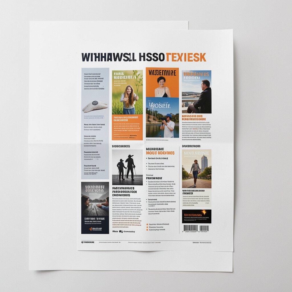
A poster is like a spotlight for your idea. When someone glances at it, they should instantly notice the main image and the big message, framed by breathing space.
Use a large headline, one main graphic, and short supporting text that reads in seconds from a distance. A practical tip is to print at a size that matches the viewing distance, since text that looks good up close can vanish across a wall.
5. Thick Brochures for Services and Workshops
Thick Brochures for Services and Workshops
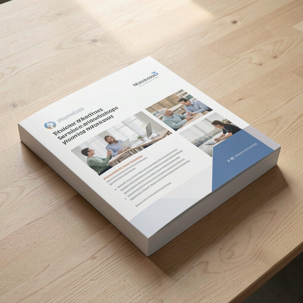
A brochure can turn a complicated offer into something friendly. Think of a tri-fold that unfolds smoothly, with photos that look sharp and headings that guide the eye without feeling stiff.
Tell a simple story across the panels, like what people get, who it helps, and how to sign up. Keep your branding consistent with fonts and colors, because a cohesive look makes the brochure feel trustworthy.
To keep cost in check, limit specialty effects and focus on strong layout skills, since layout often matters more than fancy extras. Personalize each brochure run by swapping the cover headline for different workshop topics, then reuse the inside panels to save time.
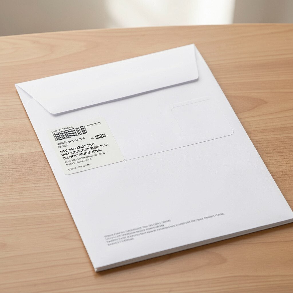
6. Mailing Labels That Keep Your Delivery Professional
Mailing Labels That Keep Your Delivery Professional
Mailers feel more polished when the label design looks intentional. A clean address block with a neat logo and a simple background color can make your package look cared for before it even arrives.
Choose a label size that fits standard envelopes so you do not waste paper or risk misprints. For a small but powerful upgrade, use a watermark-like pattern that stays subtle and helps your brand look modern.
Personalize by adding a mini message under the return address, such as a thank-you line that fits in one short sentence. When you track costs, compare sticker paper prices and test small batches first so you catch alignment issues early.
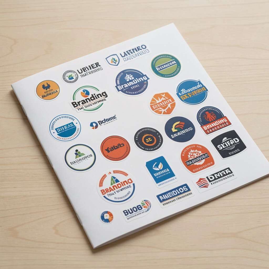
7. Stickers for Branding That Goes Everywhere
Stickers for Branding That Goes Everywhere
Stickers are the easiest way to show up in more places than you planned. Imagine a shiny, die-cut sticker on a notebook, on a water bottle, or on the corner of a shipping box.
Use them to reinforce one idea, like your logo, a slogan, or a tiny icon that represents your process. Stick to two or three colors so the sticker stays bold and readable, even when it is small.
For practical tips, choose weather-resistant vinyl if you expect outdoor use, and use a strong adhesive so it does not peel right away. Current trends often favor minimal designs, so a clean sticker can feel fresh without chasing every new style.
8. Wrapped Bookmarks for Fast Reading Wins
Wrapped Bookmarks for Fast Reading Wins
A bookmark is small, but it quietly does a lot. When it slides between pages with smooth edges and a tasteful design, it makes your brand feel thoughtful.
Include one striking image, a short quote, and a website or handle that people can remember later. If your project includes education or publishing, a themed bookmark can match the tone, like calm colors for reflective topics or bright colors for hands-on learning.
Personalize by printing a different design for each edition or chapter group, which helps collectors and repeat buyers. For cost considerations, compare single-sheet bookmark printing versus cutting services, and test print alignment so the edges look clean.
9. Branded Receipt Paper and Order Slips
Branded Receipt Paper and Order Slips
Even a simple order slip can become part of your brand. Picture smooth receipt paper with neat typography, a logo in the top corner, and a friendly line that makes customers feel recognized.
Use it to confirm details clearly and add one extra element that people will actually notice, like a short thank-you or a care instruction for a product. This small touch helps your business feel organized and reduces questions caused by missing info.
To keep it unique, consider a micro design element, like a small illustrated pattern in the margin. When you think about costs, keep formats consistent so you can reorder quickly, and avoid heavy color coverage if your supplier charges by ink level.
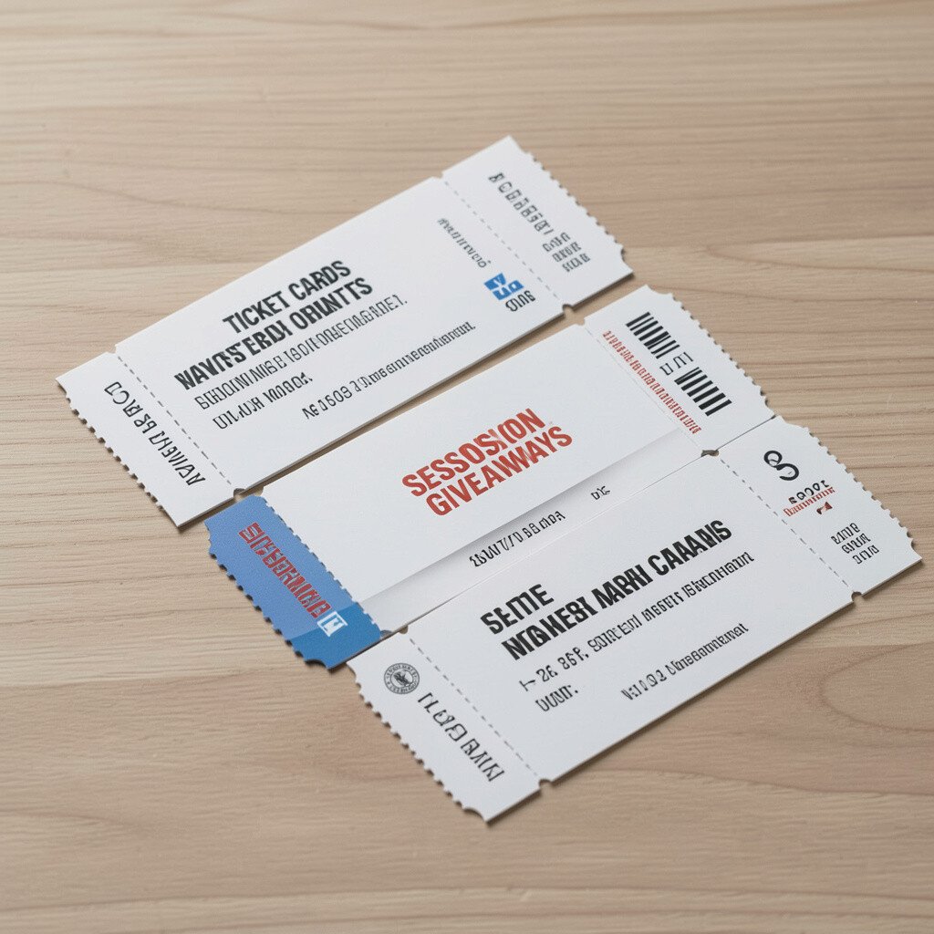
10. Ticket Cards for Events, Sessions, and Giveaways
Ticket Cards for Events, Sessions, and Giveaways
Ticket-style cards make events feel official and exciting. Imagine sturdy stock with a tear-off design, clean numbering, and a headline that looks like it belongs on a real show.
Include the date, time, and a simple entry note so guests can glance and go. Add a QR code for schedule updates, and keep the rest of the layout uncluttered for easy reading.
Personalize by printing different color bands for different time slots or ticket types, which helps staff manage check-in faster. For current trends, short, bold typography and minimal icons look modern, and they also save ink.
Handouts can turn a lesson into an action plan. When your paper has clean boxes, lined sections, and space for notes, people naturally start writing instead of getting overwhelmed.
Use a simple layout with one main goal per page, then add step-by-step prompts that match how the audience works. Practical tips include choosing a paper weight that does not feel flimsy and using high-contrast text for easy scanning.
For personalization, create versions for different skill levels by changing only the example sections. Cost-wise, you can reduce waste by printing standard pages that can be reused across future sessions with minimal updates.
12. Custom Notepads With Your Logo and Rhythm
Custom Notepads With Your Logo and Rhythm
A notepad is a daily companion, which means it stays visible longer than flyers. Think of a pad with a tidy logo placement, consistent spacing, and a satisfying tear edge that makes sharing easy.
Use ruled or grid paper depending on your audience, because the format should fit real writing habits. If your project is creative, try adding subtle design elements in the margins so the page feels branded without being distracting.
Personalize each run by switching the cover theme, like seasonal colors or a series name, so the notepad feels fresh. When you plan costs, compare pad sizes and binding options, since smaller runs or simpler binding can keep budgets comfortable.
13. Catalog Cards for Portfolios and Product Showcases
Catalog Cards for Portfolios and Product Showcases
Catalog cards help your work travel farther with less explaining. Picture thick cards with sharp photos, a clear title, and a short description that makes your items feel organized and ready to sell.
Include one standout feature per card, such as a material note, size range, or what makes your process special. Make it practical by leaving space on the card for a stamp, a date, or a handwritten buyer note.
For uniqueness, use a consistent template but vary the background texture or photo crop so each card feels tailored. To manage cost, print in batches for your top products first, then expand your set based on what gets the most attention.
You can also match current trends by using clean, modern typography and strong contrast, which keeps cards readable in galleries and trades. When your cards look confident, people feel more confident too, and that confidence can turn into real conversations.